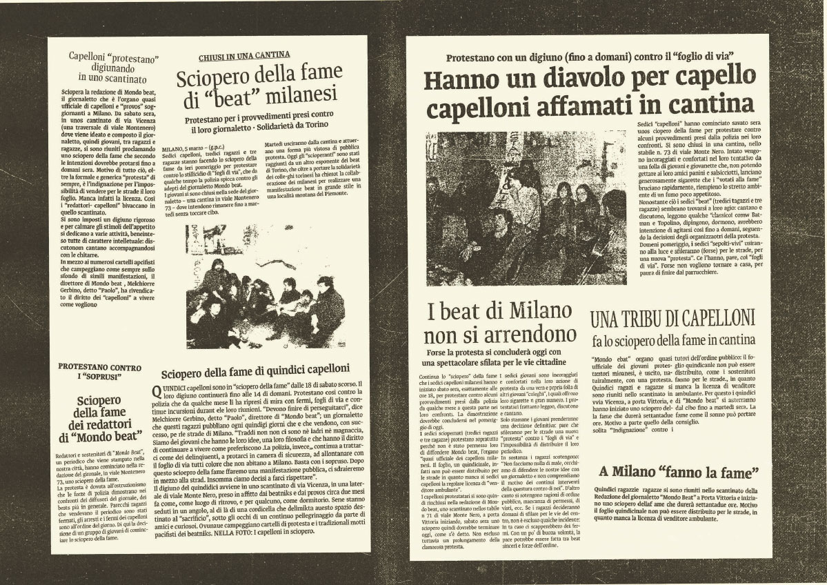
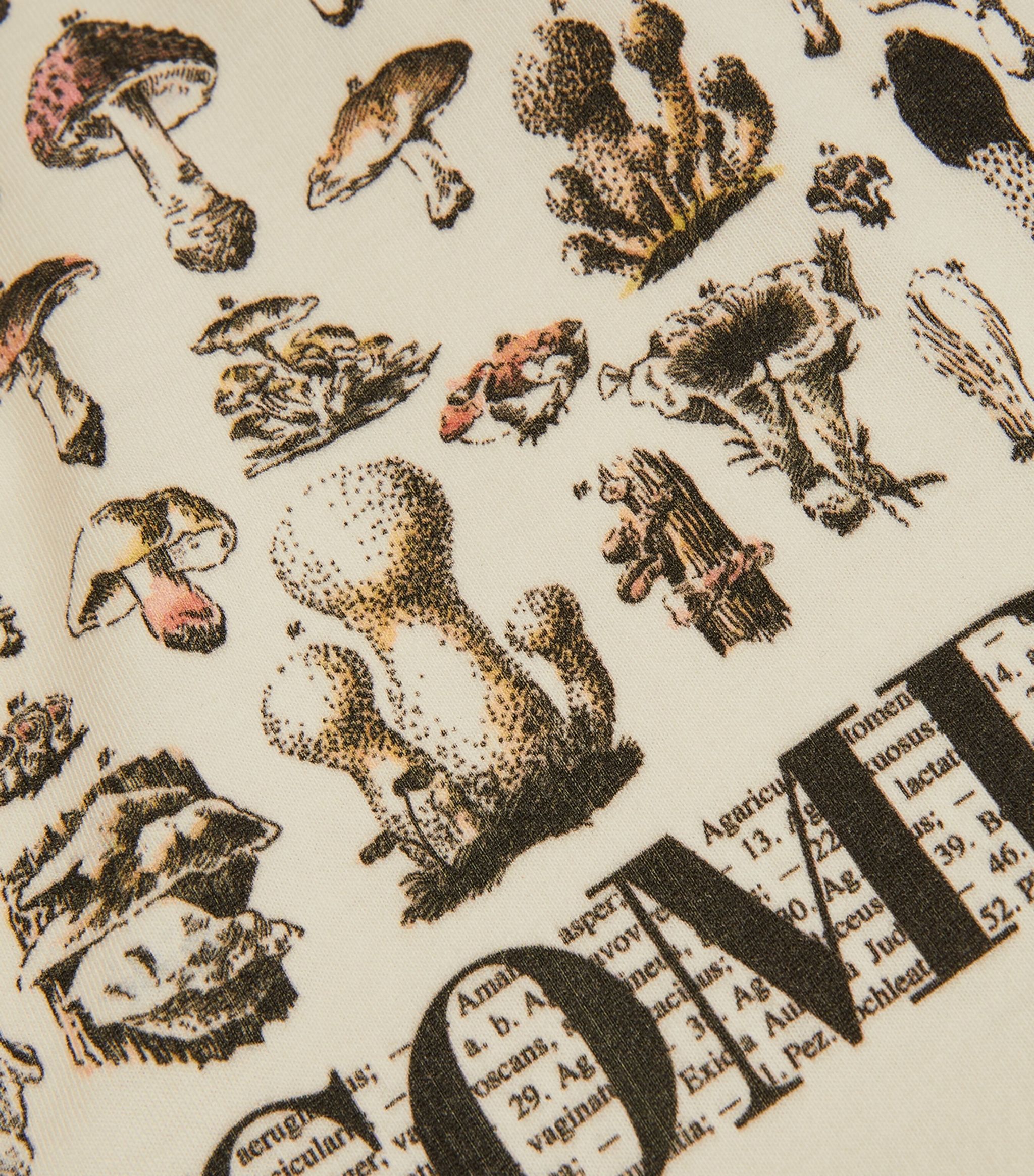
the west african forest of symbols
It’s finally online the contribution I wrote for the number 41 of Progetto Grafico, the first one under the new direction of Carlo Martino. Read it here.
It’s finally online the contribution I wrote for the number 41 of Progetto Grafico, the first one under the new direction of Carlo Martino. Read it here.
An interview with Pittogramma, a digital platform to promote emerging graphic designers and share relevant contents and resources. Read it here.

Entering Otherworlds is the second edition of the Alphabetica symposium series, exploring design and writing systems through a wide lens of their formal, cultural, and imaginative dimensions.
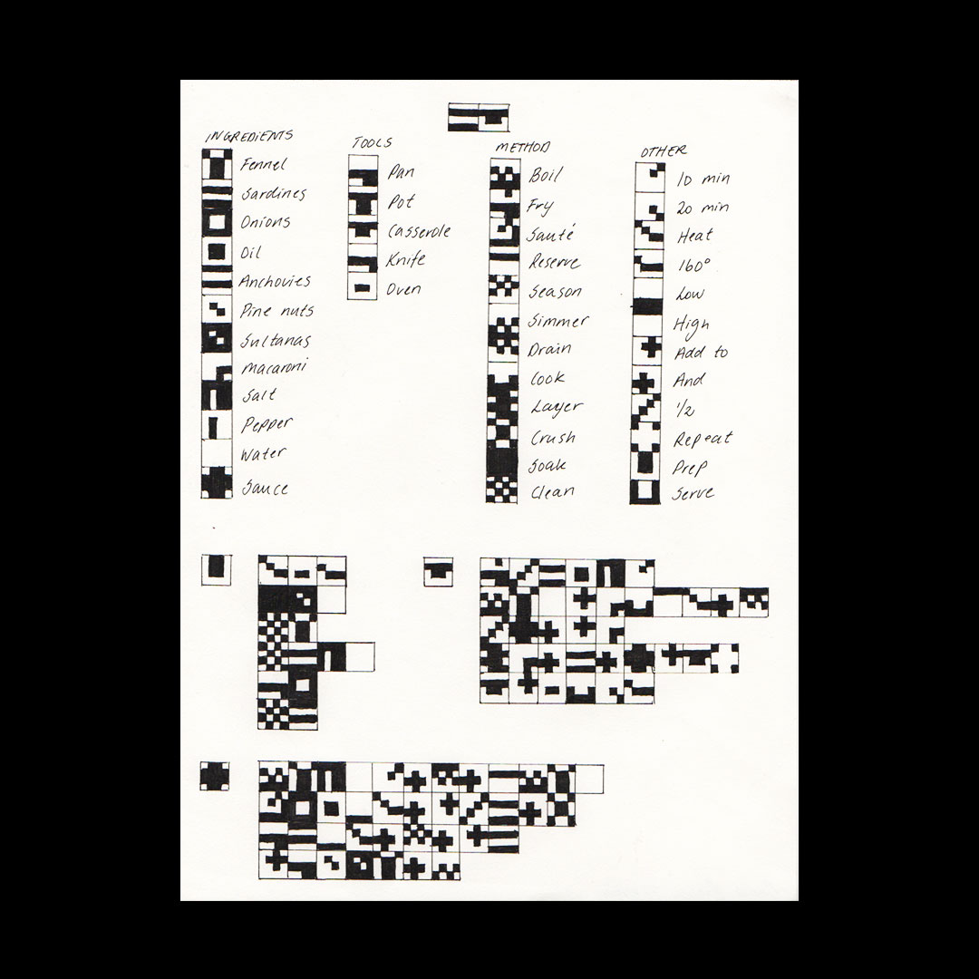
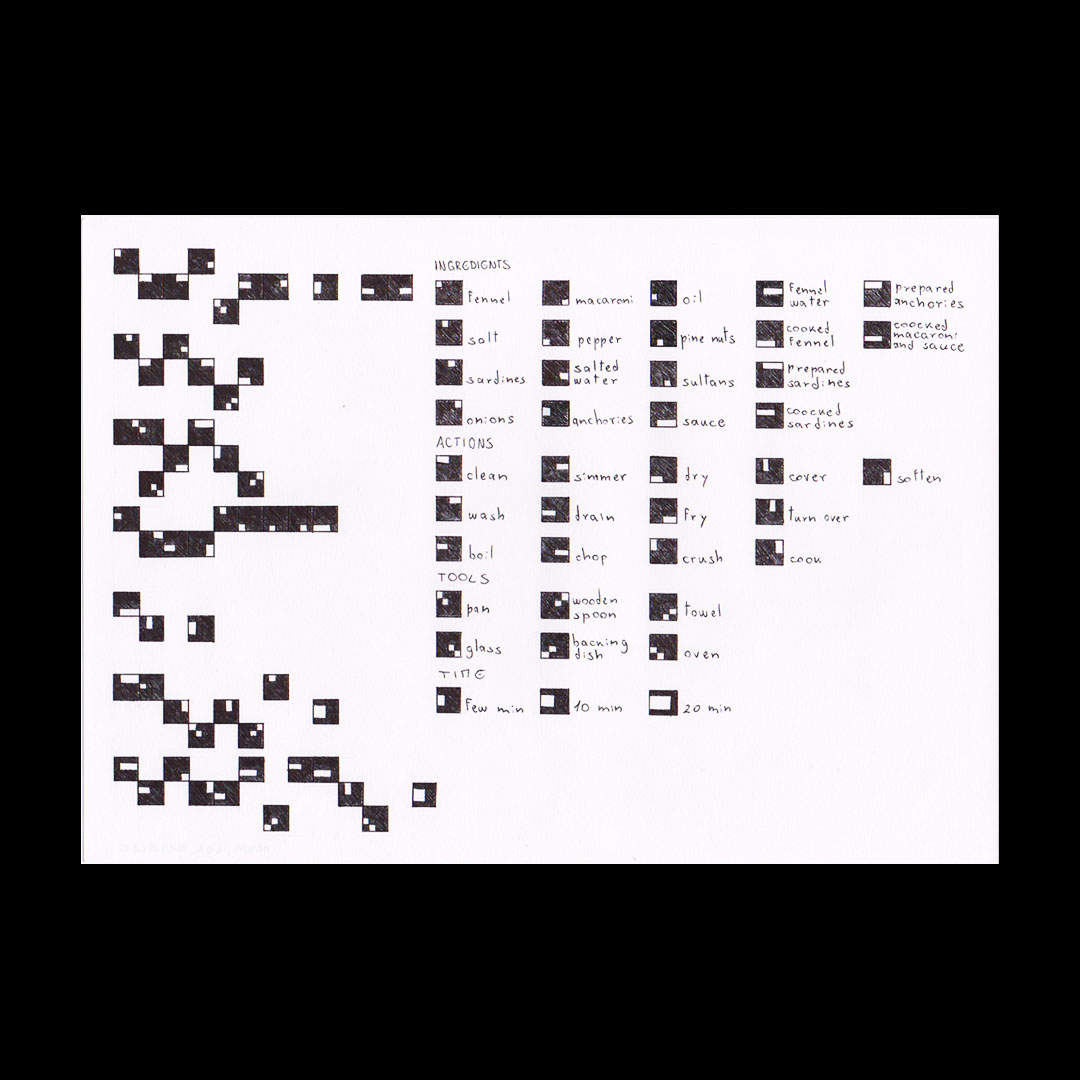
Two developments from an assignment during my Design Methods class at IED Milano, year 2023/2024
Students: Lea Amadei, Bulatovic Dunja, Michelle Frigoli, Perotti Darma, Sævarsdóttir Thelma, Siggeirsdottir Ragney Lind.
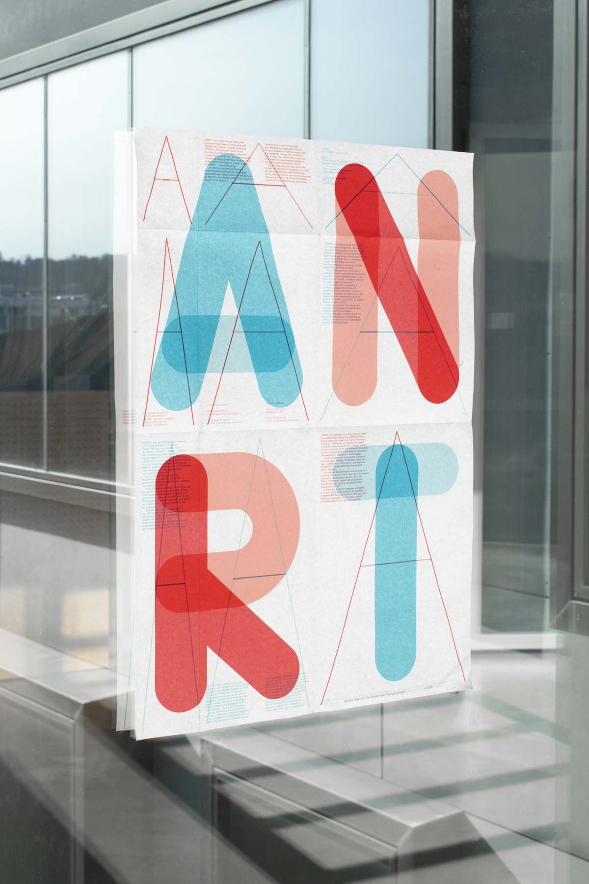
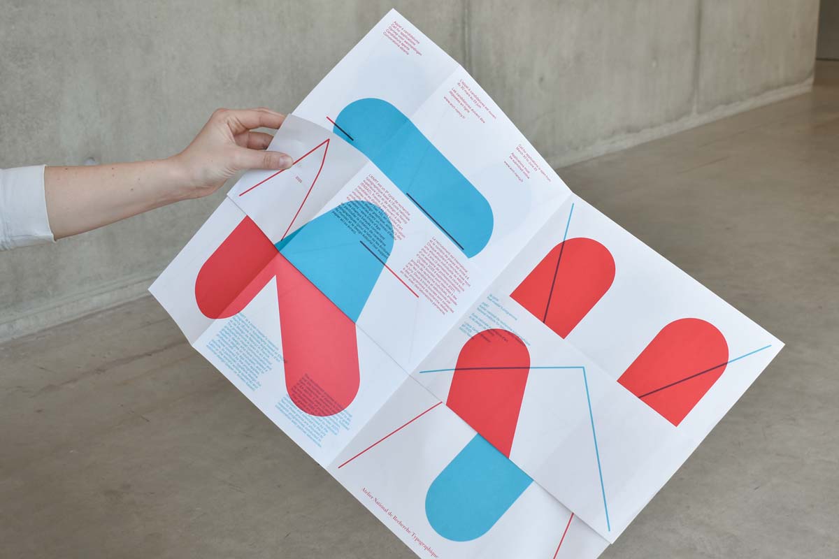
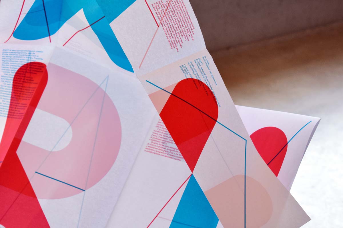
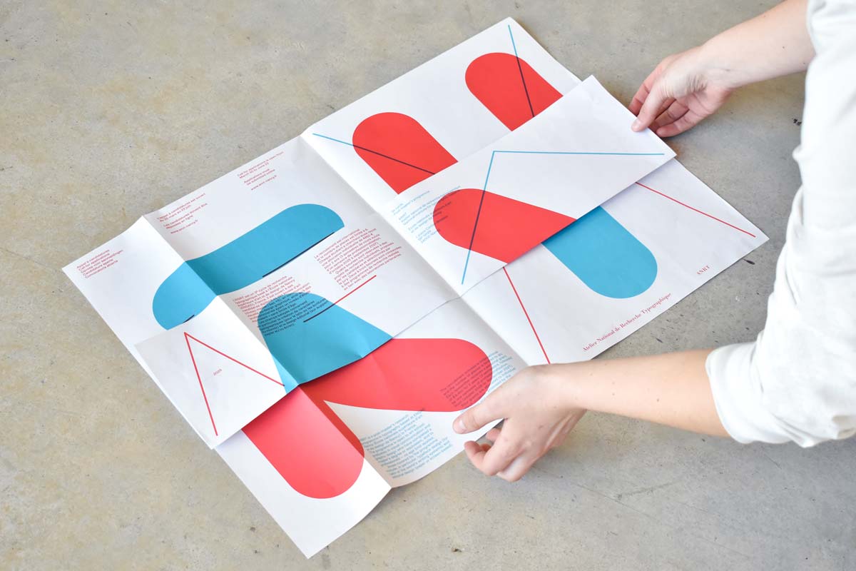
Designed together with Lothaire Arnoux, Louna Bourdon, Franco Jonas, Coline Malaman and Myrthe Van Rompaey, during a workshop by Studio Helmo. The poster is meant to be hung behind a source of light to be completely legible.
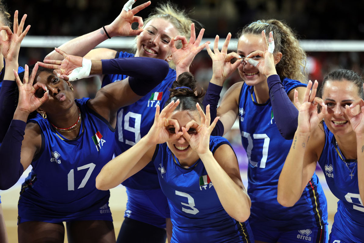
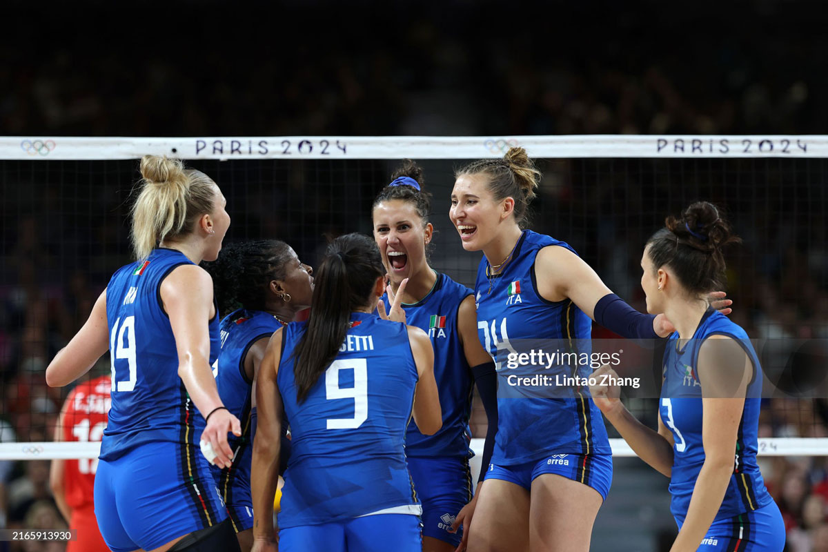
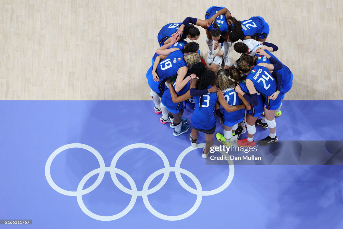
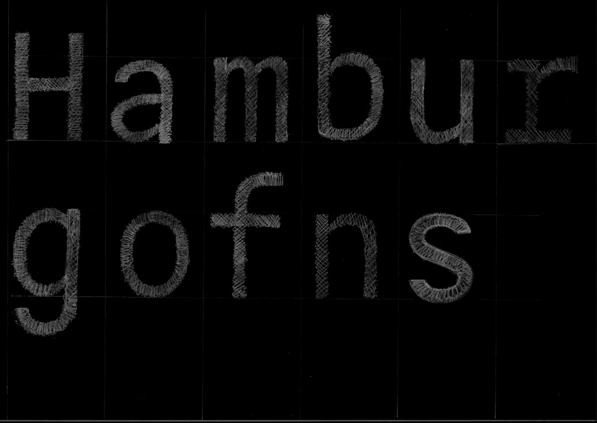
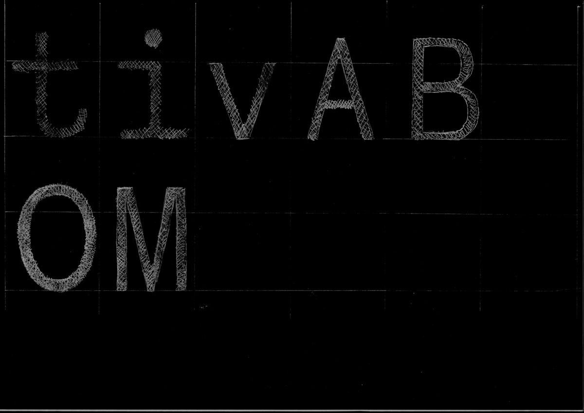
In collaboration with IED Milano, I coordinated an international team from the bachelor Graphic Design course to develop a new type system for Erreà. With Alessandro Gallina, Arina Ilchenko, Daniele Colombo, Daria Varcalli, Anka Pavlovic, Camilla Pessina, Simone Passante, and Tamara Hruska, we brought four new fonts to life: Midfield Pro, Korner, Offside, and Ace.
Designed for numbering and customization, these typefaces are now used across a wide range of Erreà products, including sports jerseys, sweatshirts, and training suits.
In 2024 Italy won the Gold metal at Paris Olympics 2024 wearing one of the typefaces.
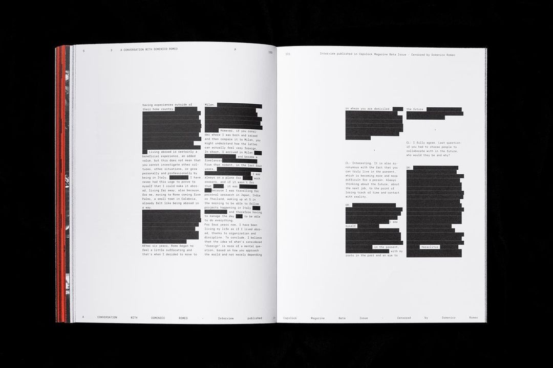
I have been asked to design a typeface for the design and art studio of Domenico Romeo. Their current graphic system uses a monospaced typeface, which led me to pitch the idea of a fake mono, maintaining the spirit while granting better legibility. Designed with Benedetta Bovani.
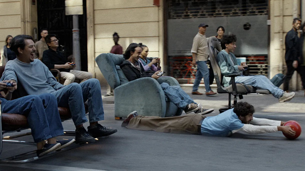
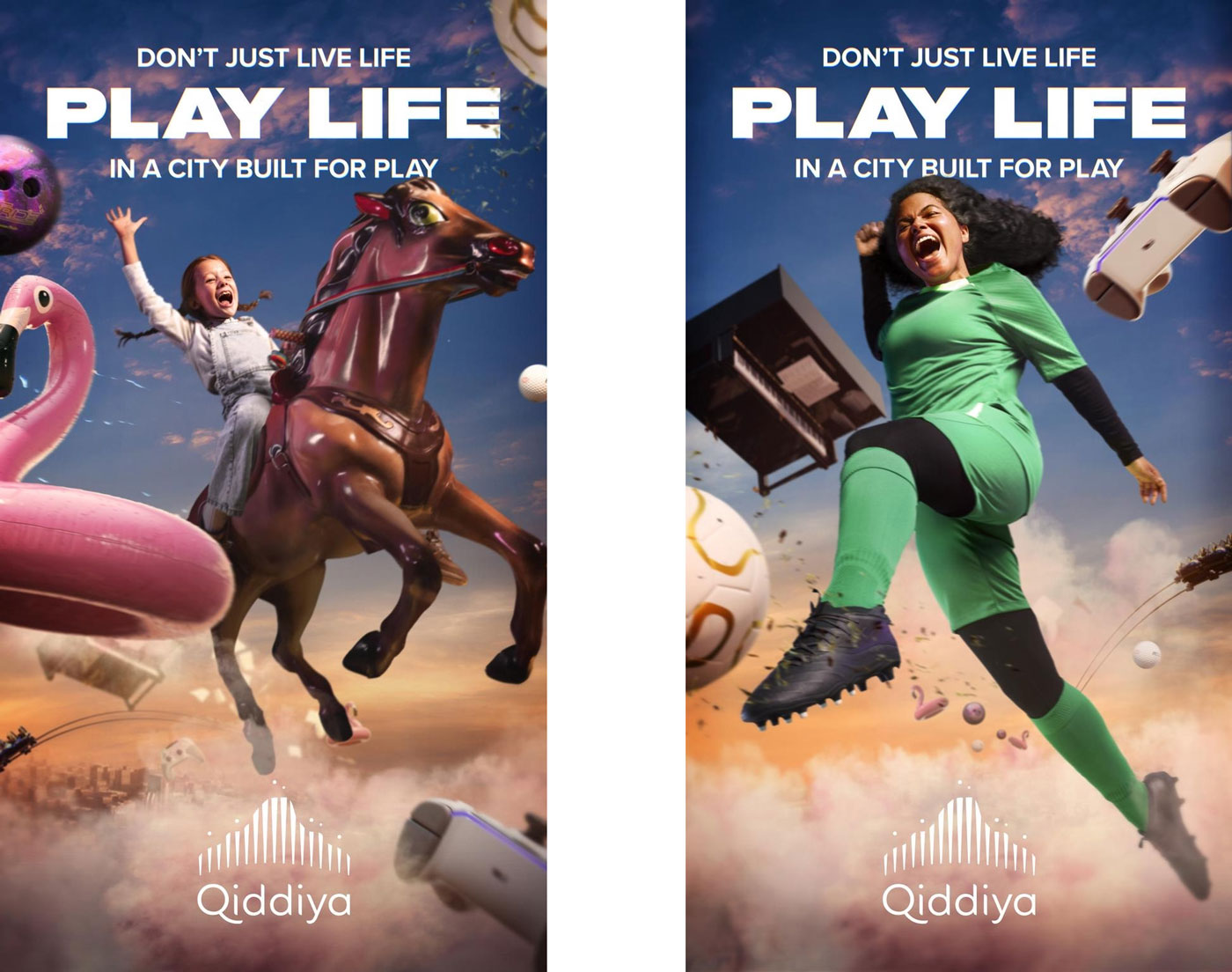
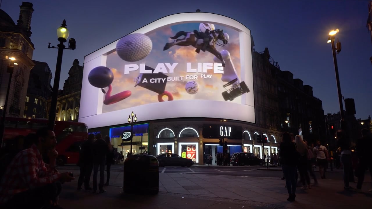
Qiddiya is conceived as the world’s first city fully dedicated to entertainment, sport and culture — a place where you don’t just live life, but Play Life. While the physical city is still under construction, the campaign had to bring it to life in people’s imagination, turning everyday scenes into invitations to a more playful way of living. Collaborating with Droga5, I helped define the visual language of the Play Life campaign.
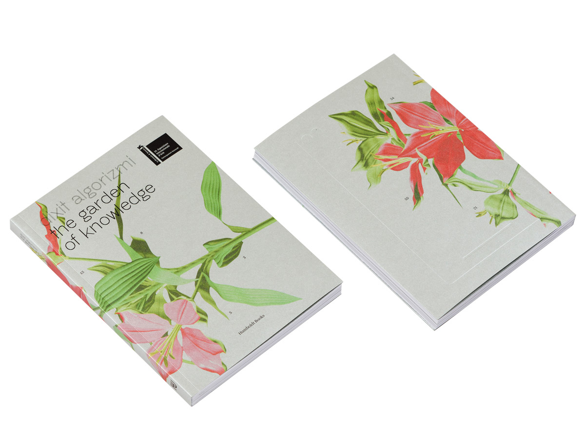
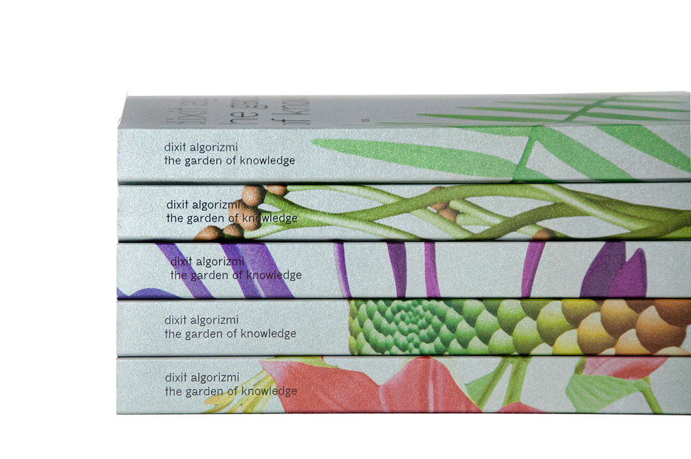
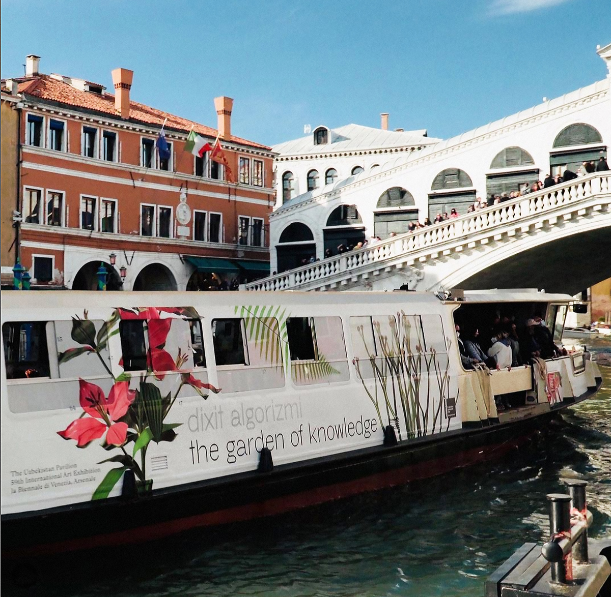
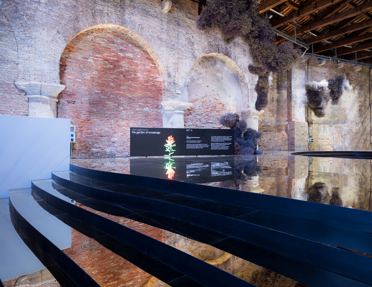
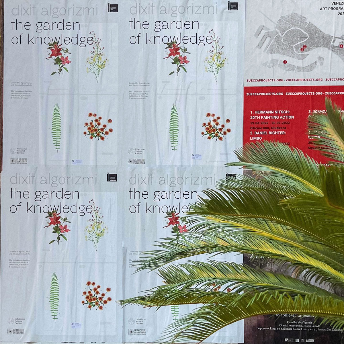
Dixit Algorizmi is an ongoing exhibition and research project curated by Space Caviar and Sheida Ghomashchi, commissioned by ACDF, Art and Culture Development Foundation under the Ministry of Culture of the Republic of Uzbekistan. Initiated in 2019, it has been presented at CCA Tashkent (2021) and at the 59th International Art Exhibition, la Biennale di Venezia (2022). The catalog, “Dixit Algorizmi The Garden of Knowledge” — published to coincide with the opening of the exhibition in Venice, presents a series of essays by international authors reflecting on origin myths and narratives surrounding modern technologies, using the lens of contemporary artistic practices to explore their forgotten roots and overlooked resonances with distant places, times, and cultures. Within Studio Folder, I designed all the advertising, catalogues, gadgets and exhibition graphics for the Uzbekistan Pavilion at the 59th Art Biennale di Venezia.
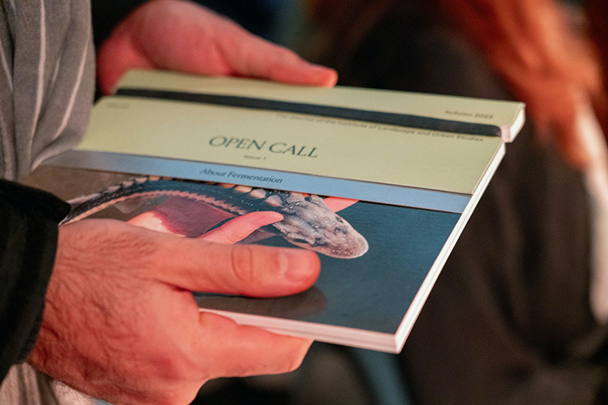
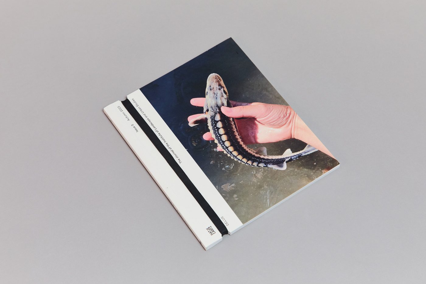
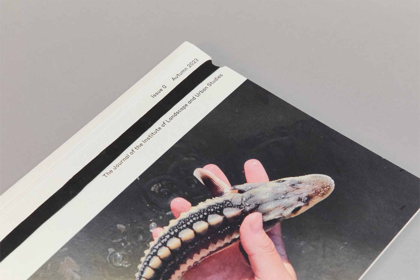
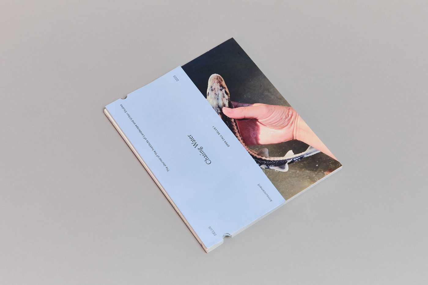
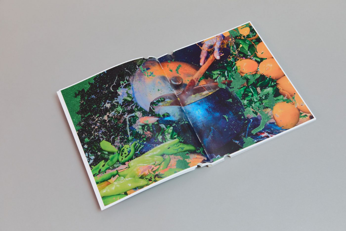
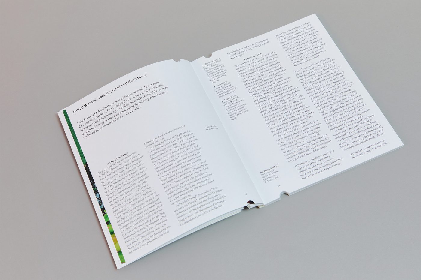
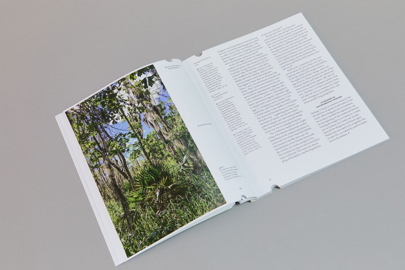
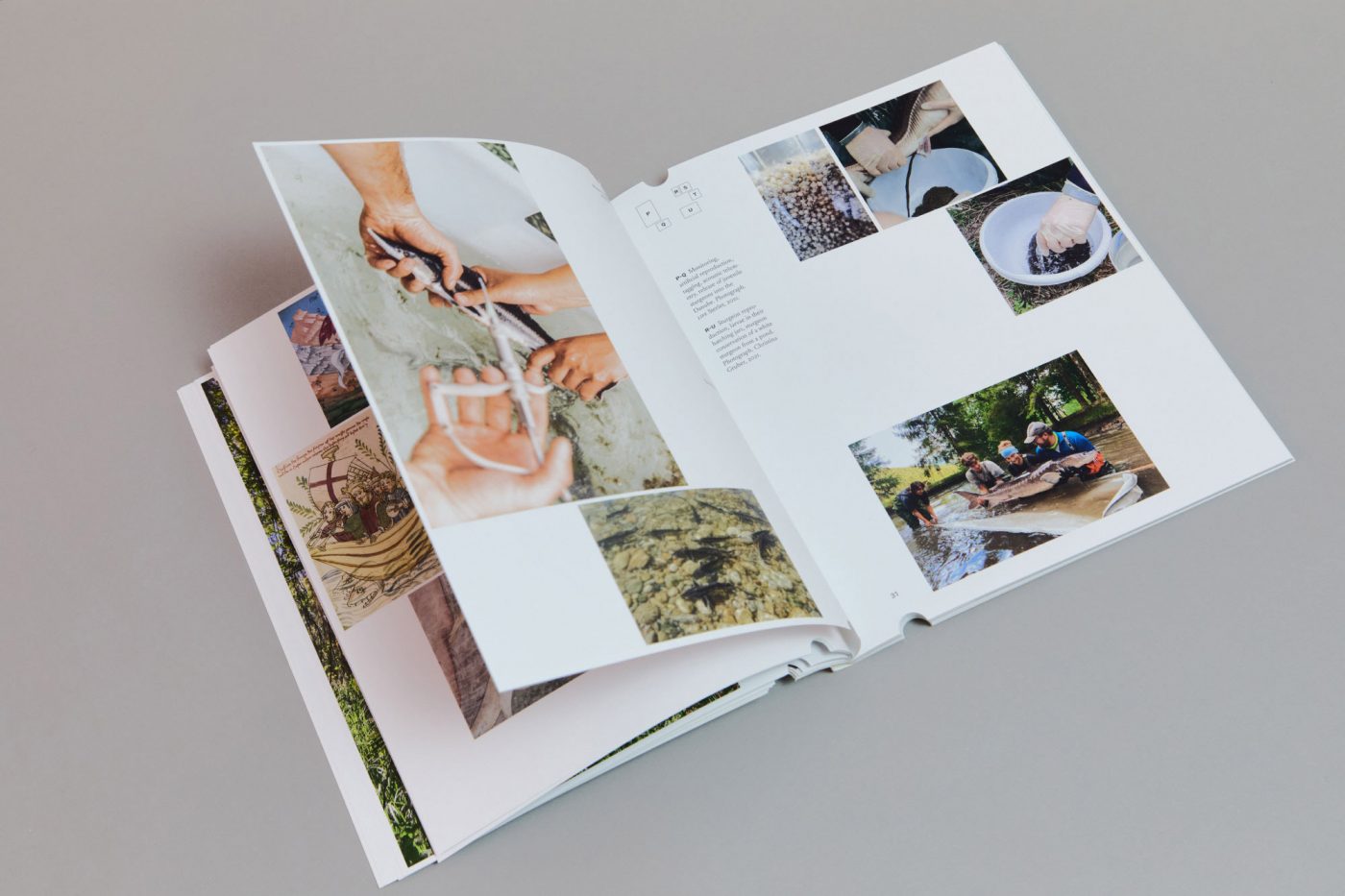
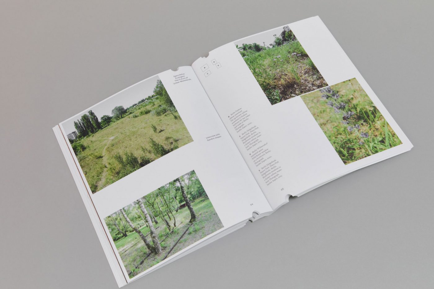
The publication was designed as an assemblage of contents that document and record the activities of the Institute of Landscape and Urban Studies at ETH Zurich throughout the years. Conceived more as an ecosystem of periodicals rather than a traditional magazine or review, the publication translates different type of contributions into different editorial formats. Longform stories, visual essays, interviews, lecture transcripts, exhibition documentations and countless other publishing typologies can find an original and ever-changing design within this framework.
Winner of Silver Award at European Design Awards 2025.
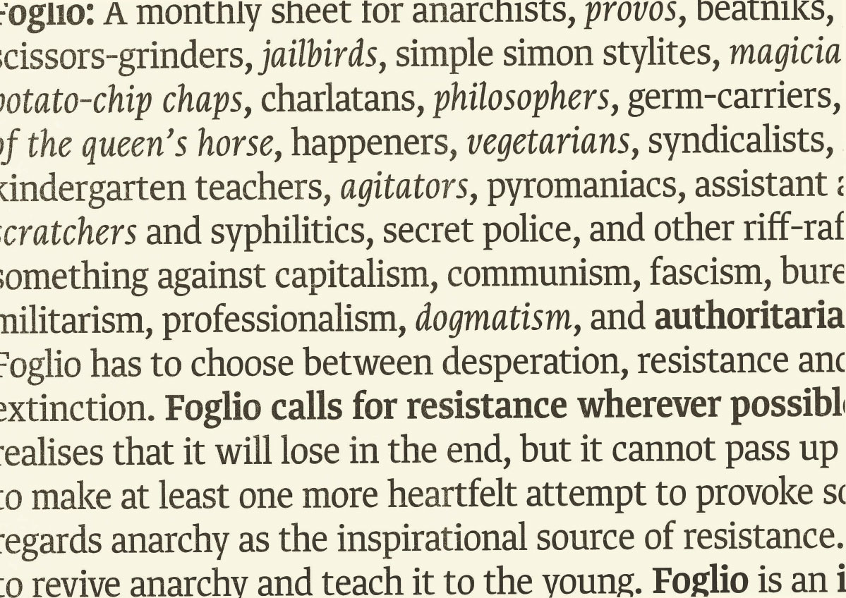
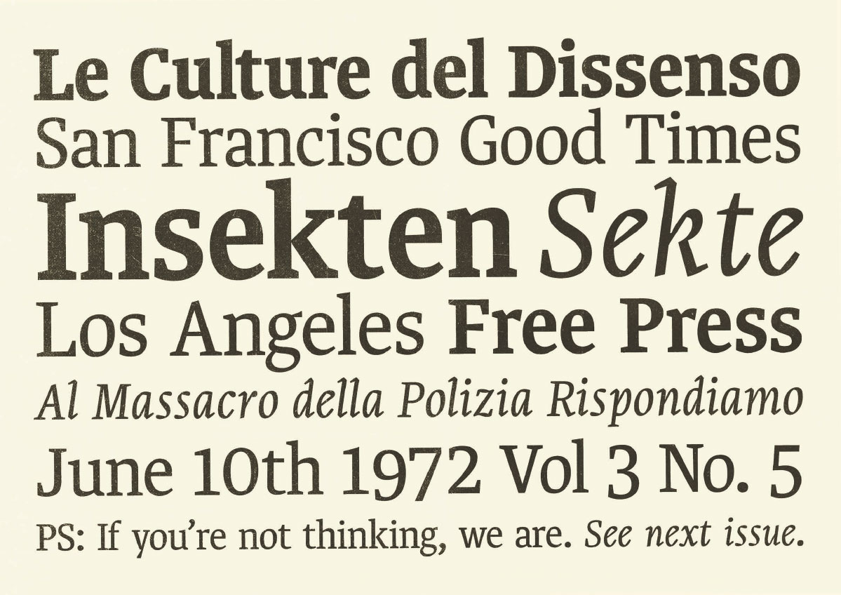
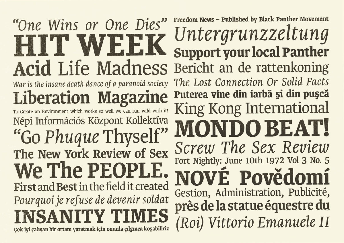
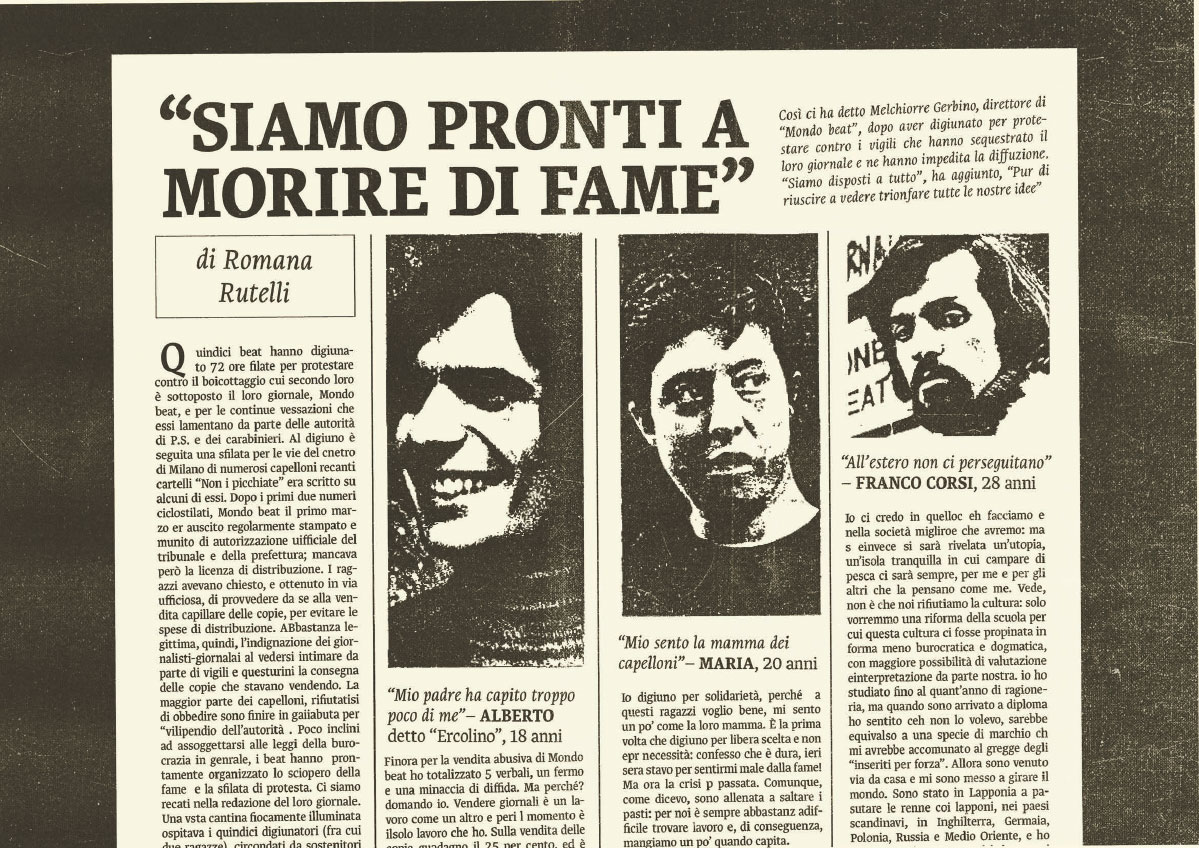
Final project at Type@Cooper Extended, a newspaper typeface for the Italian daily ‘Il Foglio’. The uniqueness of the format – a single broadsheet paper folded once, and consisting of only four pages – makes the final product resemble a wall of text. The typeface was designed to replicate the proportions of what is currently in use, while giving the overall texture of the pages a warmer and less rigid appearance. One of the goals of this design was to address a common issue in Italian journalism and typography, namely the capital ‘È’ (E grave) – also the third person singular form of the verb 'to be' – which affects all kinds of publications.
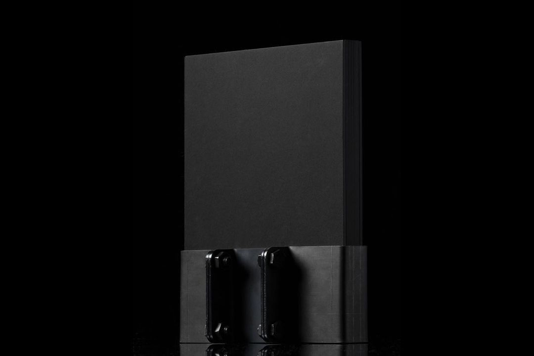
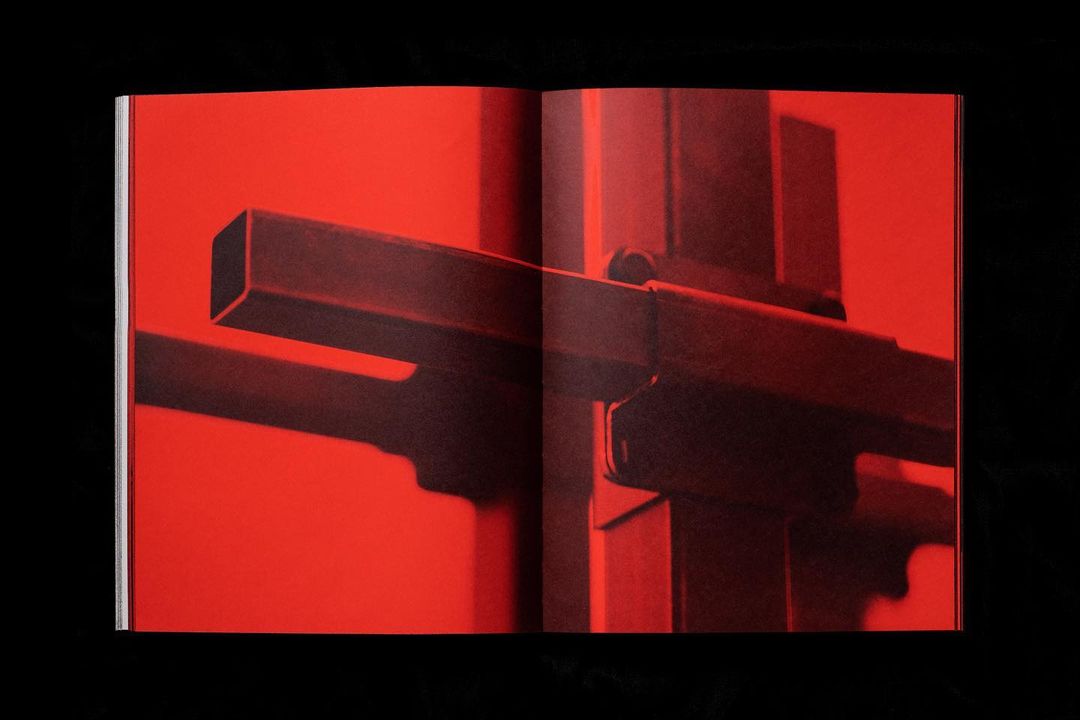
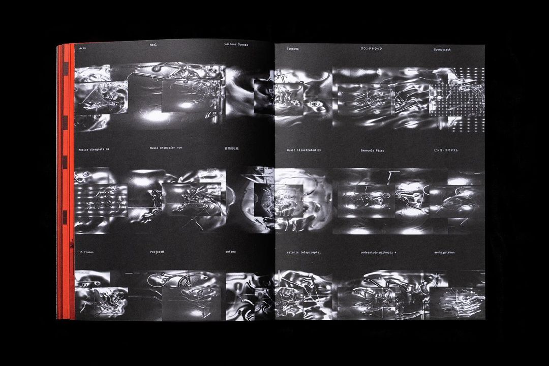
The first book of artist Domenico Romeo that brings together sculptures, photography, paintings, visual expressions of sound, and text. An edition of 300 pieces installed on a 3.2kg iron base joint. Weaving together architecture, anthropology and the empirical nature of time and space, Romeo presents an experiential journey that explores alternative approaches to understanding and unraveling the complex knots of identity between language and gesture, materials and codification, experience and revelation.
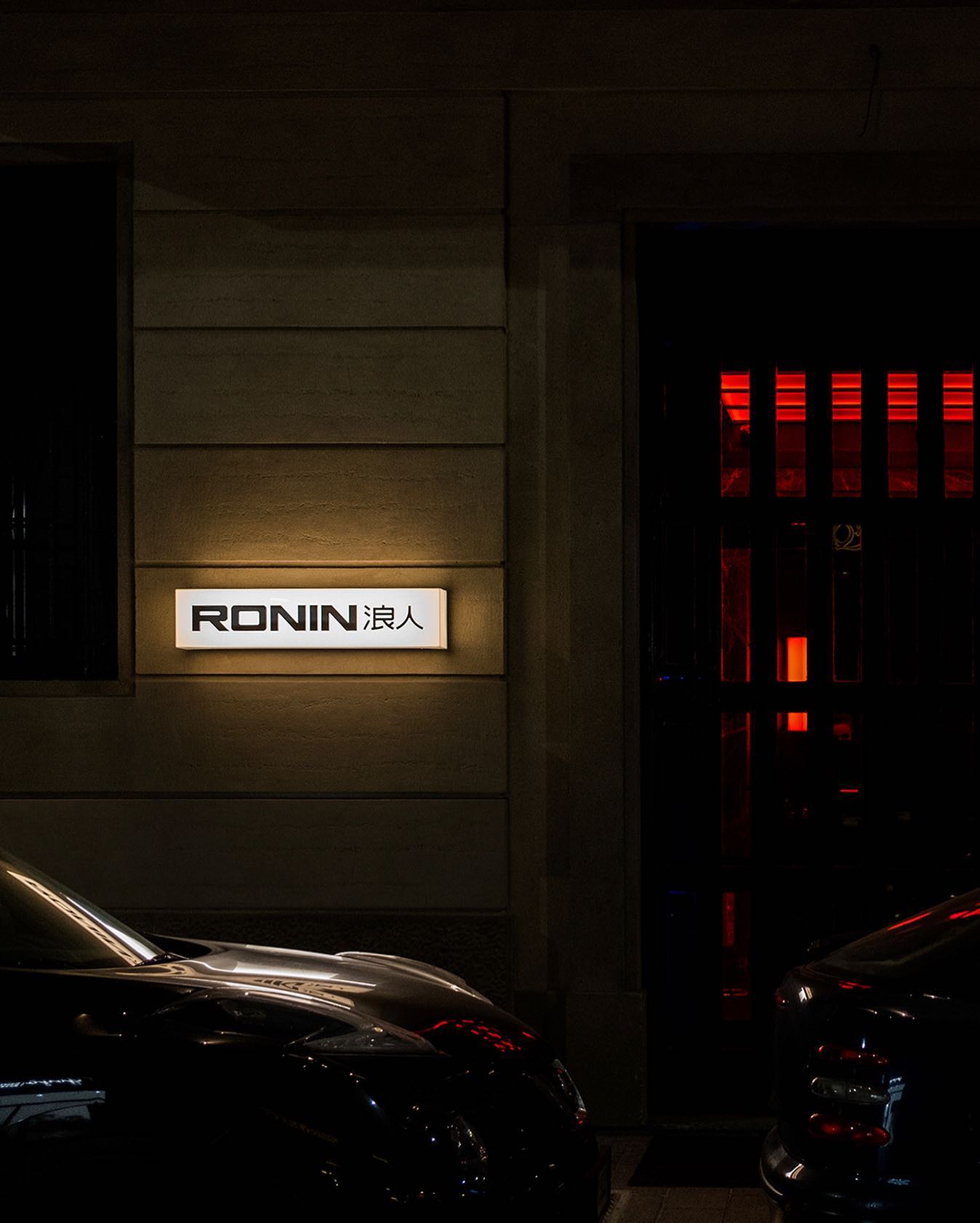
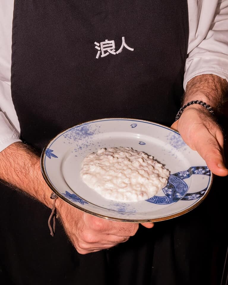
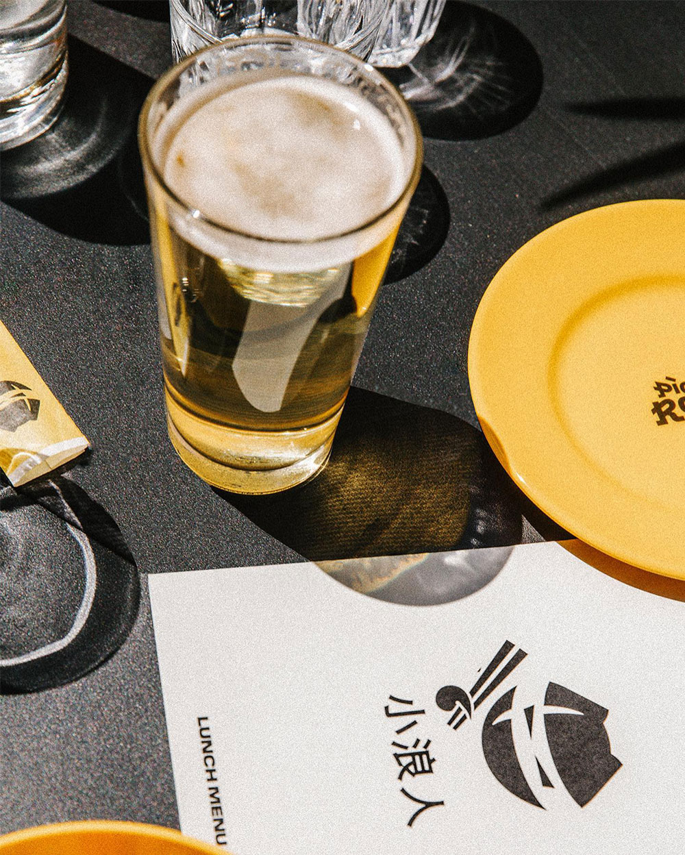
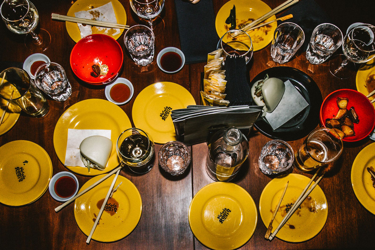
Ronin is a one-stop, multi-floor destination for an immersive journey through Japan’s culinary and entertainment subcultures. Located in the Chinatown district of Milan. Ronin features an unprecedented four floors of restaurant and bar spaces, which feel like small parallel universes, all linked together by a winding staircase. Its seven souls, comprised of three restaurants, two bars, a karaoke and a member’s club, make up for a unique experience in the restaurant world. With Metaprog, I created a multifaceted brand identity to reflect the contemporary and varied essence of the building.
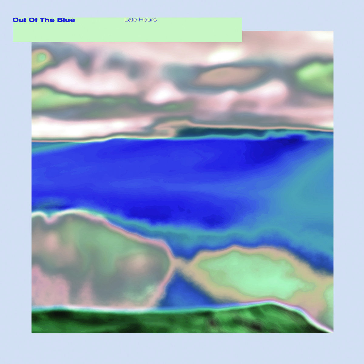
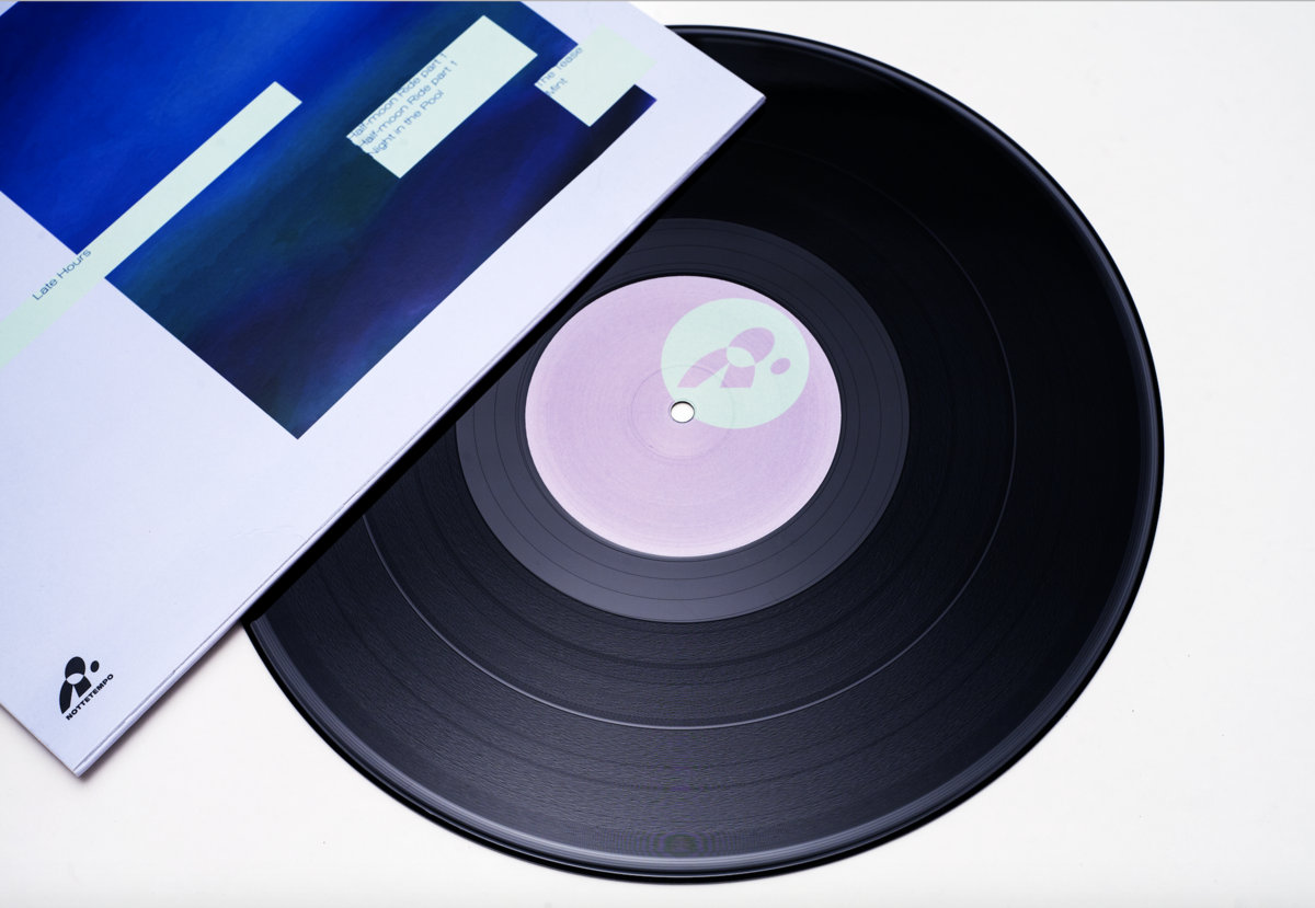
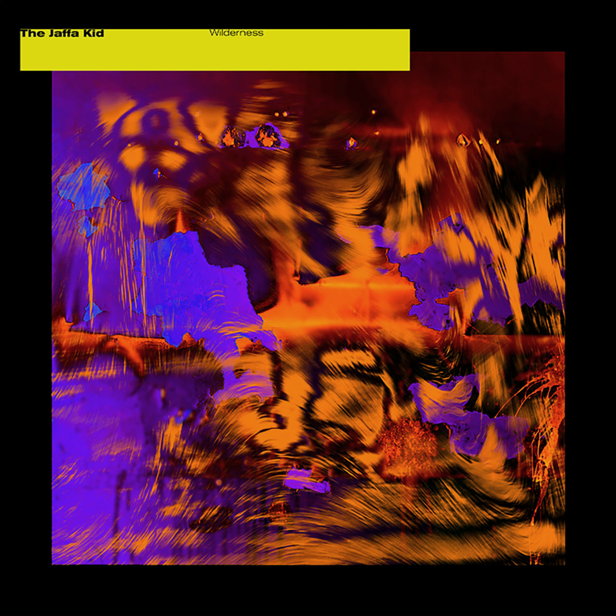
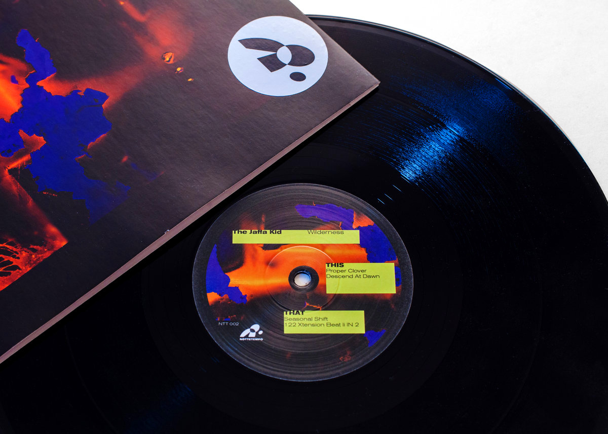
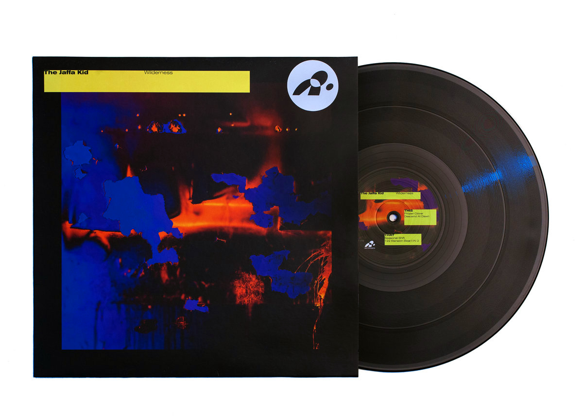
Nottetempo is a fresh independent music label born from young minds in Milan. With Domenico Romeo, we designed the logo and the record sleeves for the first two issues of the label.
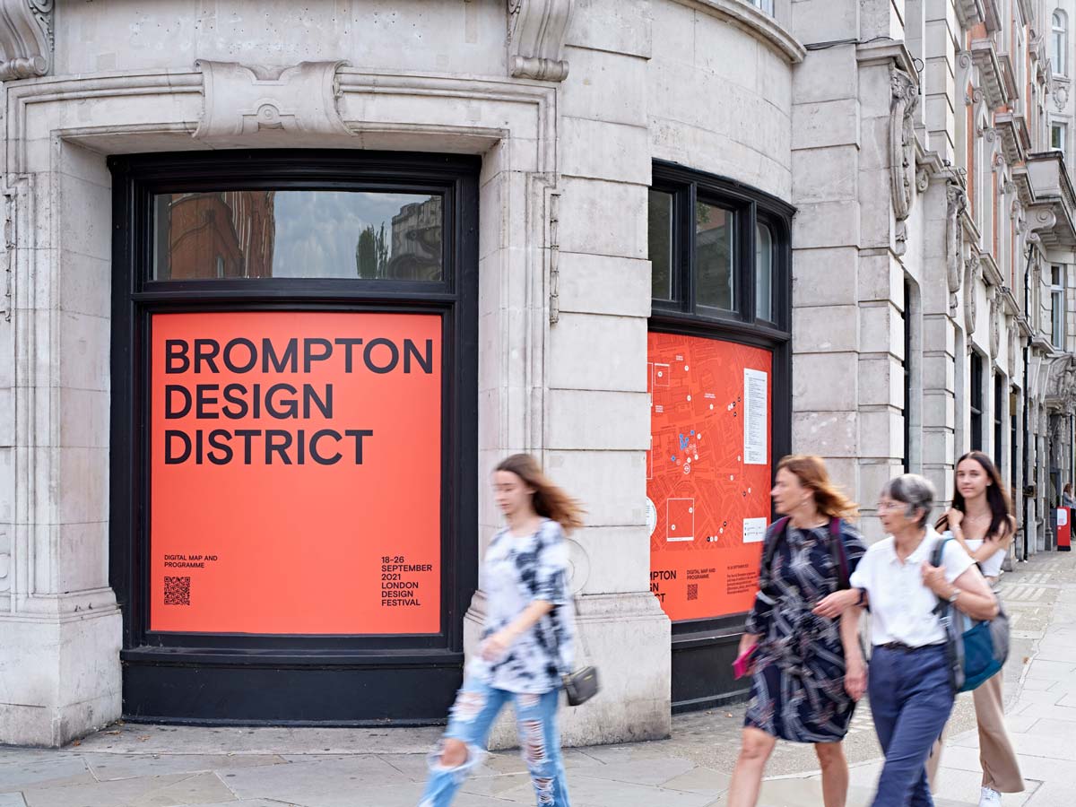
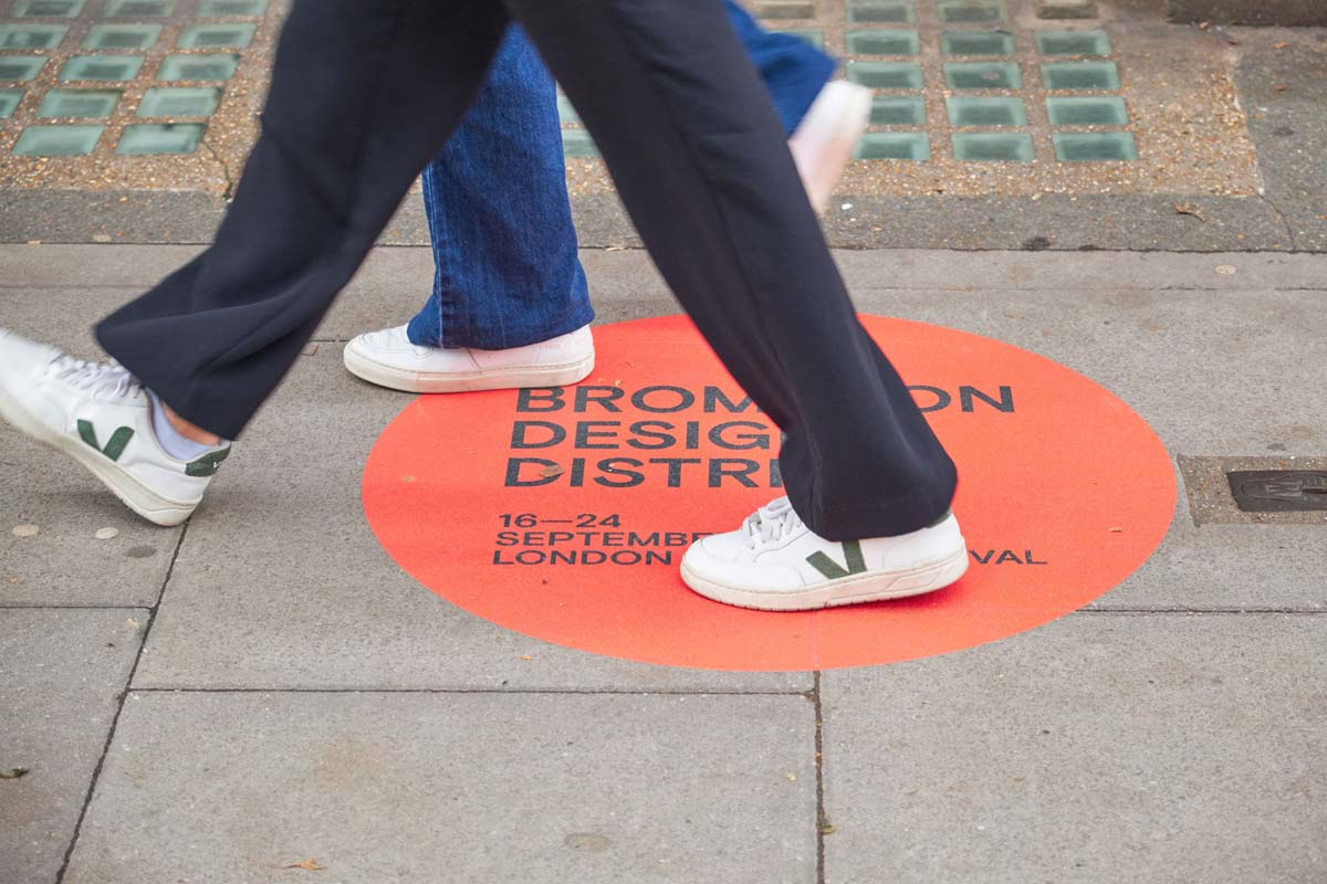
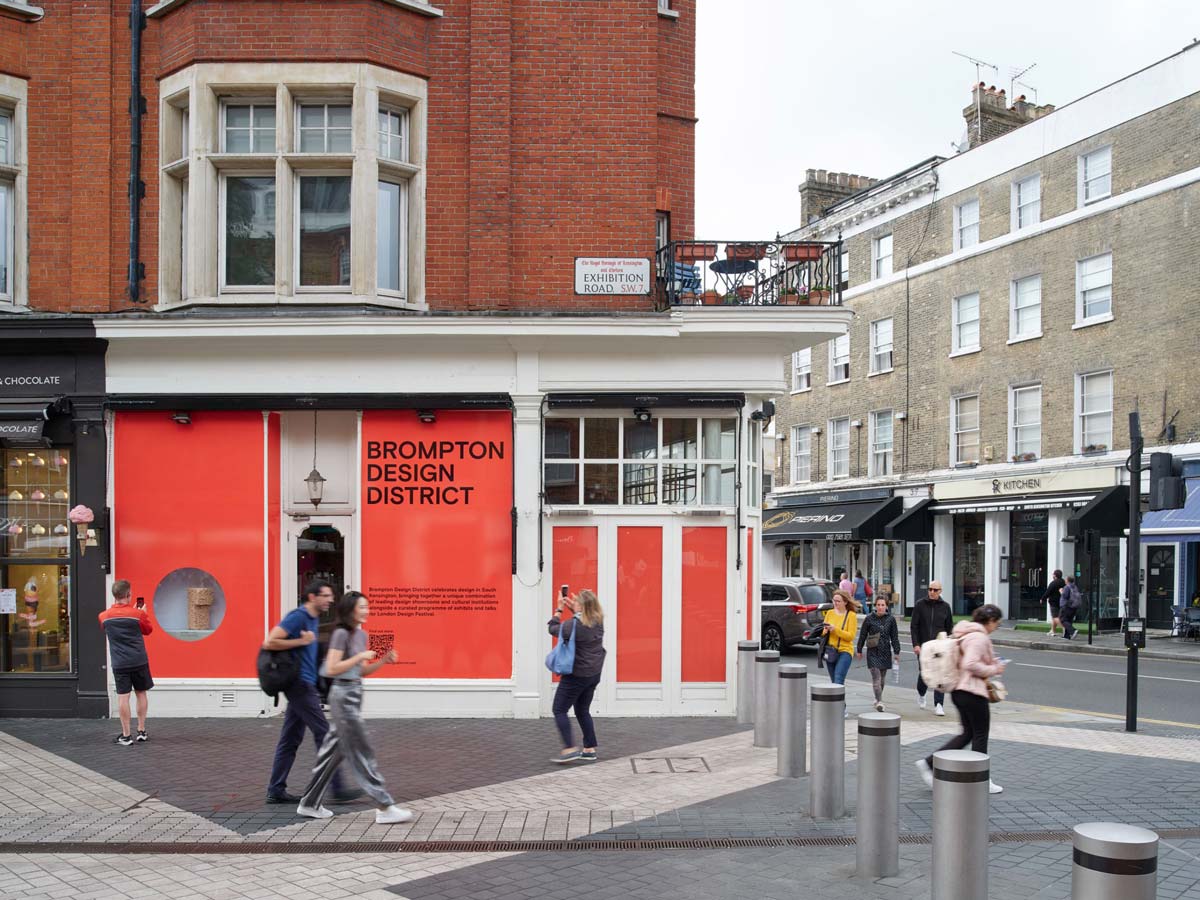
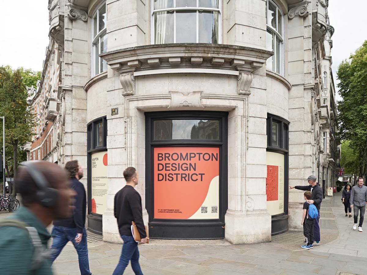
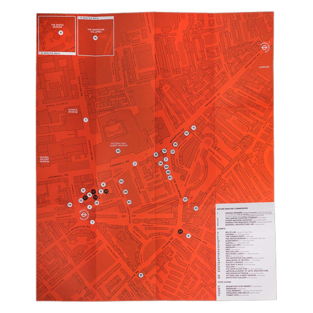
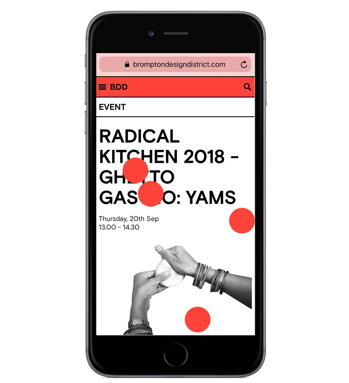
Answering a brief asking for a more contemporary and playful identity, With Studio Vedèt and Luigi Gorlero we designed and produced the new website for the Brompton Design District, one of the most inspired participants of the London Design Festival. After ten years, we invigorated their physical and online presence with a dynamic, and sometimes intrusive design.
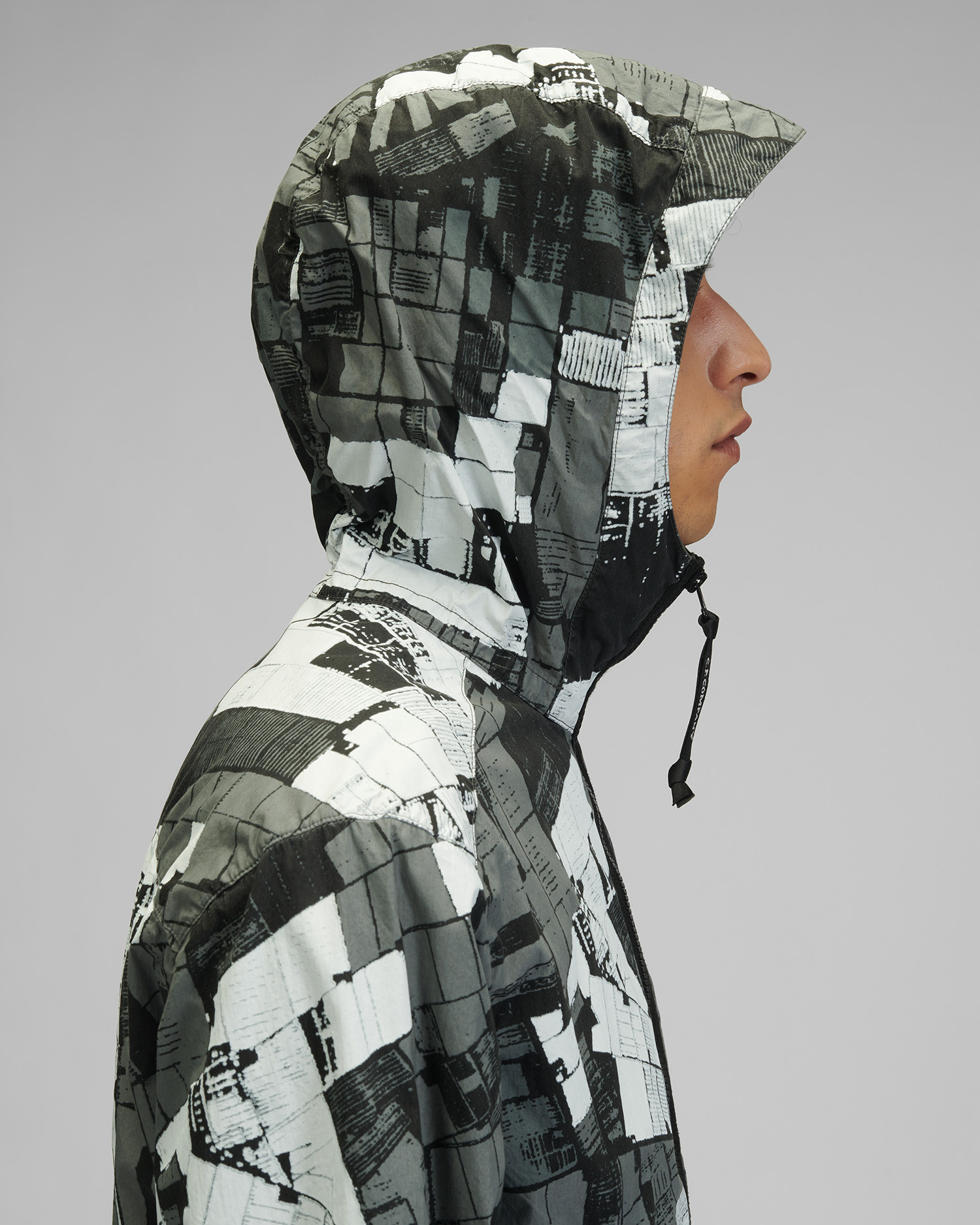
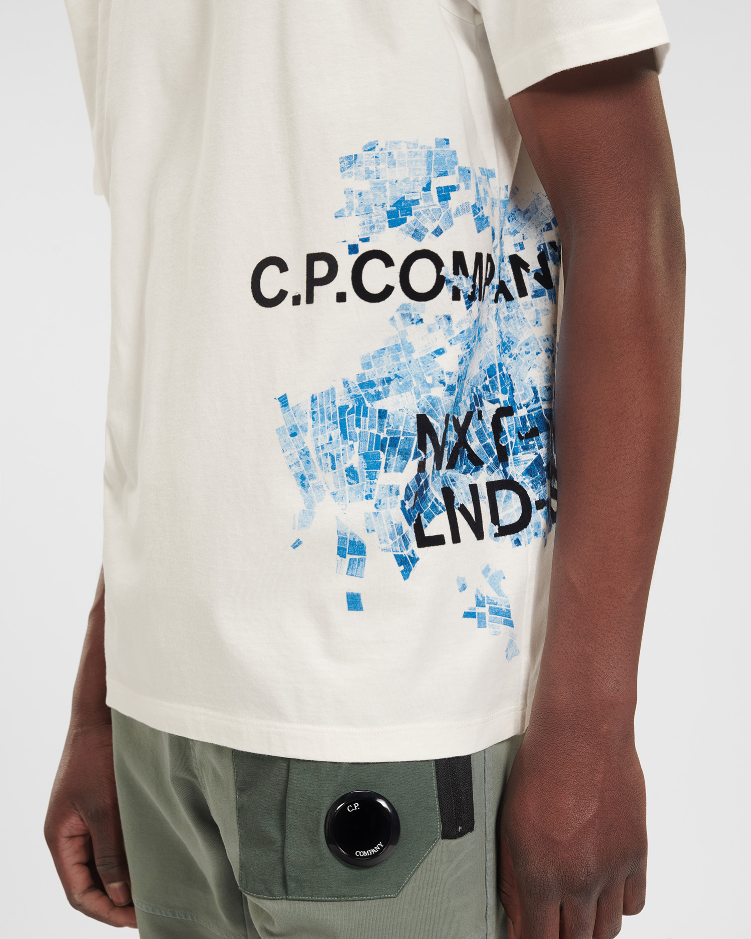
“A Next Landscape” refers to the overarching concept developed for C.P. Company FW 2020 collection. It represents a hopeful image of a future urban landscape, in which nature is given the space to grow back vitally and spontaneously amongst the essential architectural forms of the city. Working directly from reference images of the abandoned and now overgrown post nuclear city, a collection comprised of a series of structural elements represent the entire spectrum of this hypothetical next landscape.
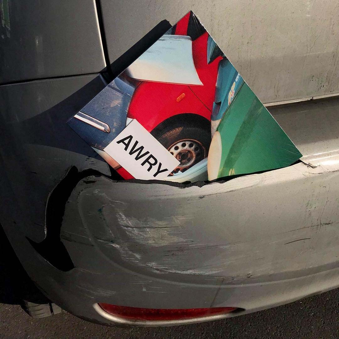
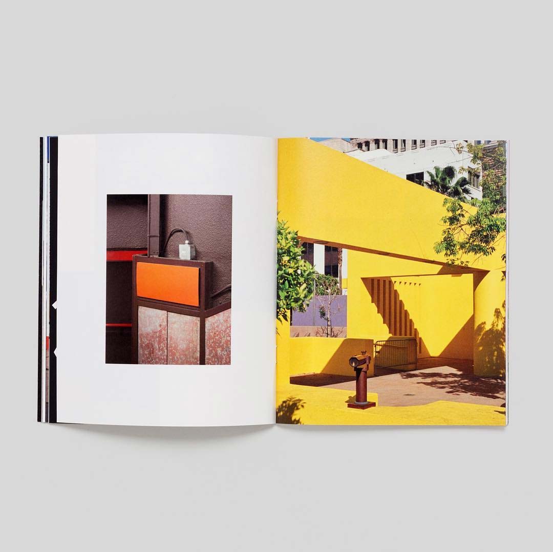
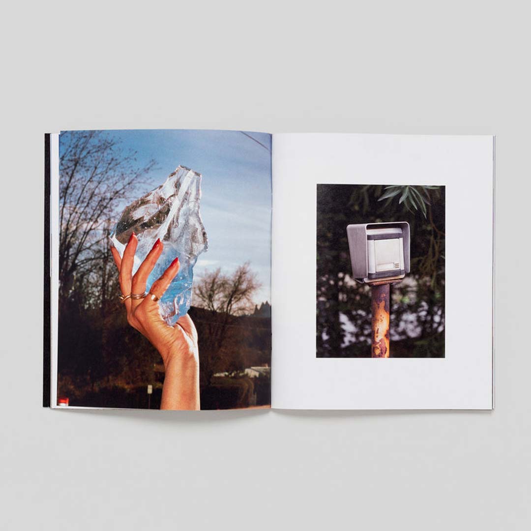
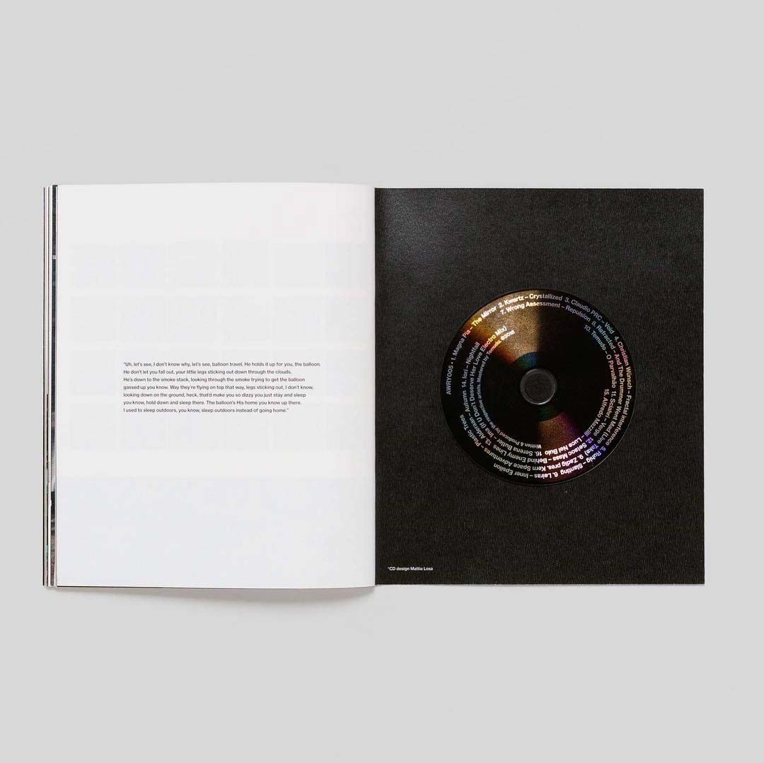
AWRY005, a 95 minutes digital album within a photographic booklet. The release features 16 original tracks, including renown artists Kwartz, Christian Wünsch, Zadig and Claudio PRC among others. The physical version consists of a CD enclosed in a 76 pages publication with uncanny photographs by Leonardo Scotti and Louis De Belle, cleverly put together alongside graphic interventions by artist Domenico Romeo.
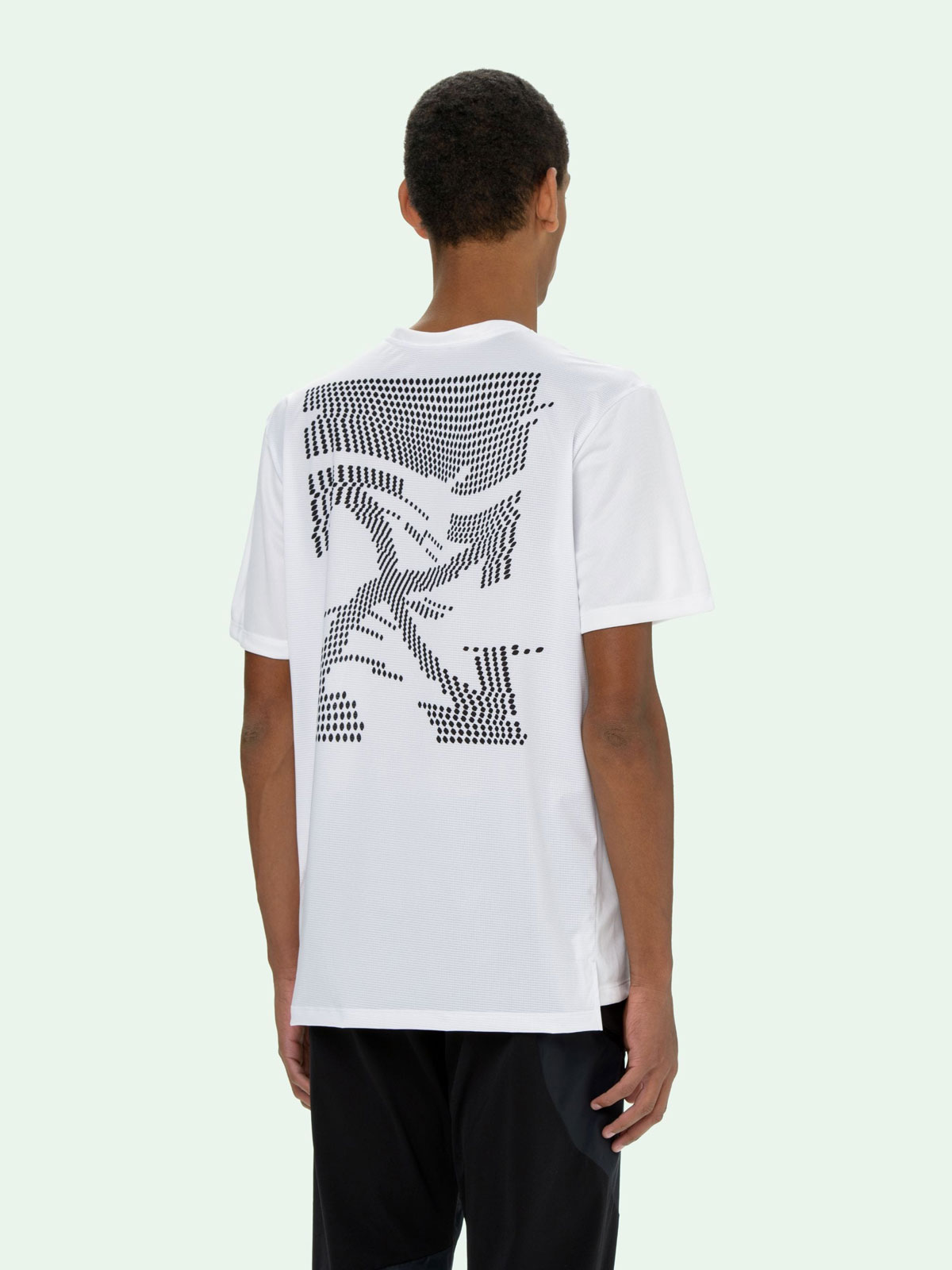
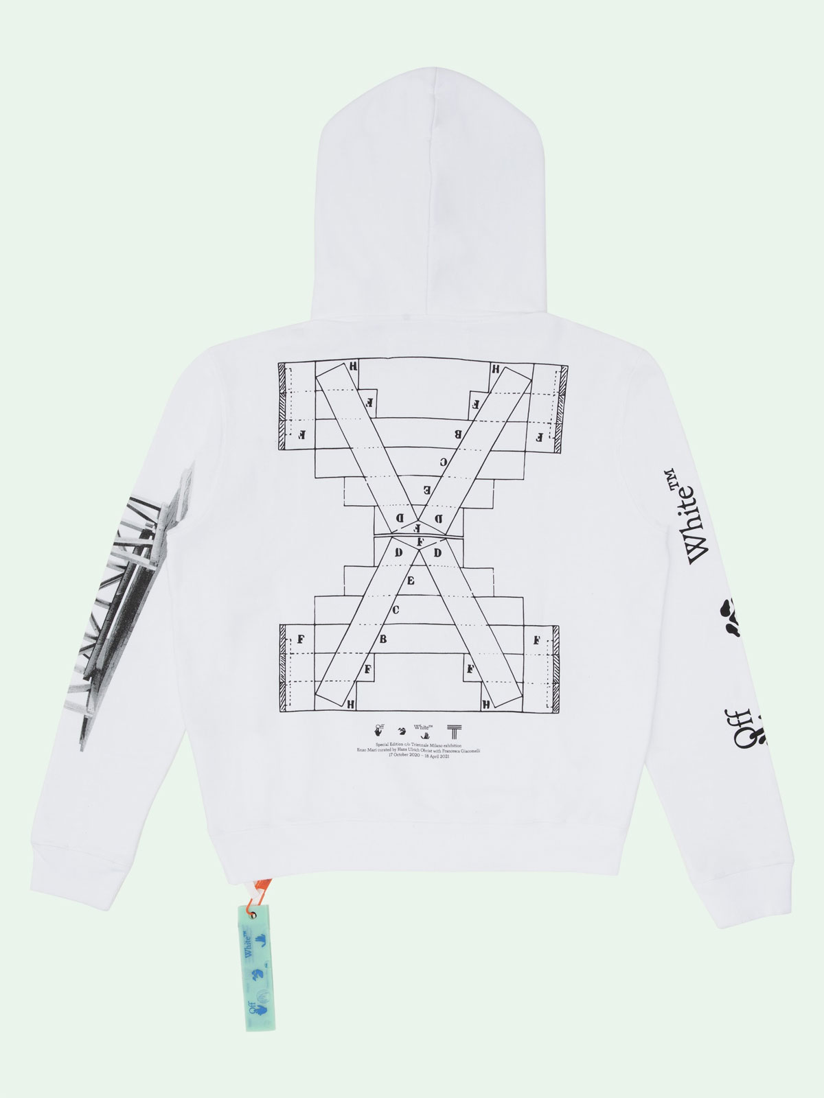
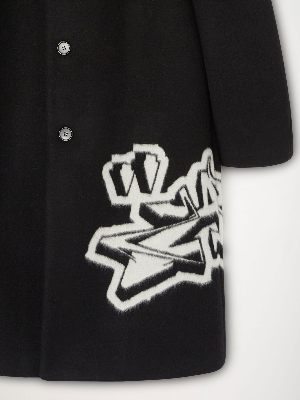
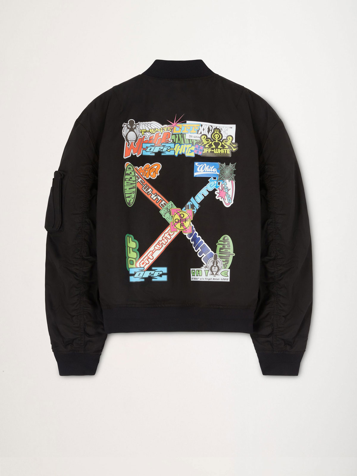
Under the direction of Virgil Abloh, the Off-White graphic team was composed of people both internal and external to the brand’s office, who help stacking ideas and concepts for the customisation of garments and accessories for each season in the main and secondary men’s collections. During my years working with Metaprog, I had the chance to pitch various graphics and ideas.
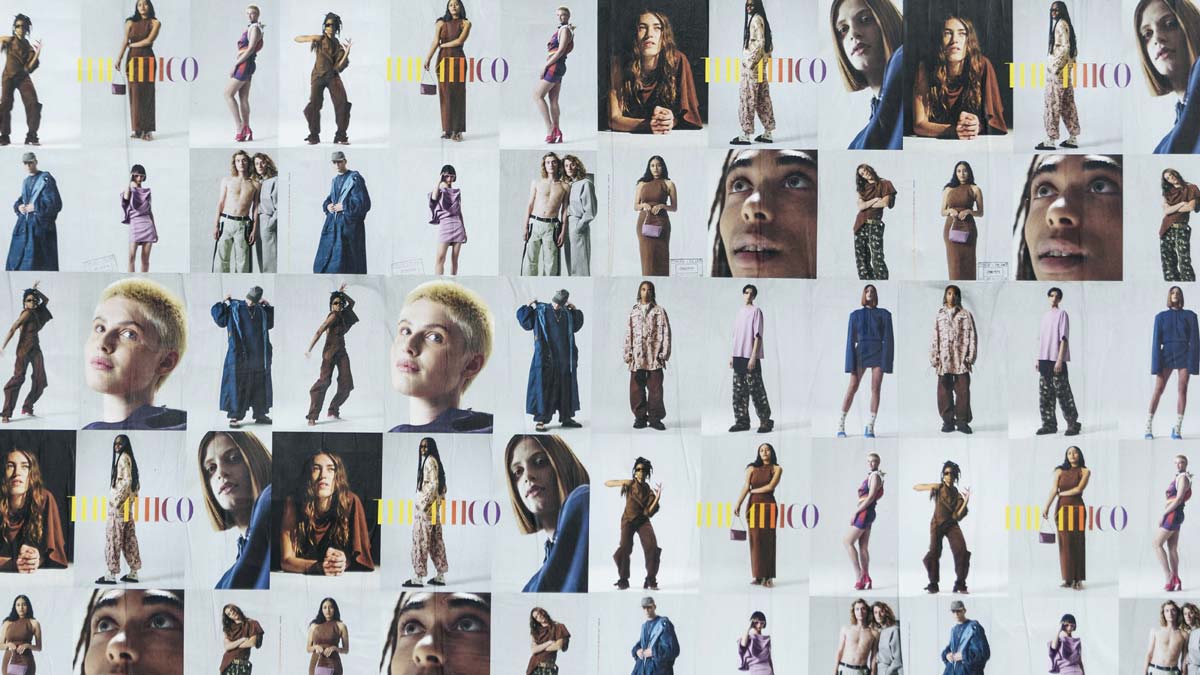
Life at Large is not just a collection or clothes, it’s a mindset that urges us to open up with each other, especially now. The clothes are decidedly relaxed, loose, and open, just like the attitude of The Attico’s community. With Metaprog I designed textiles and garments’ customisation graphics for the collection.
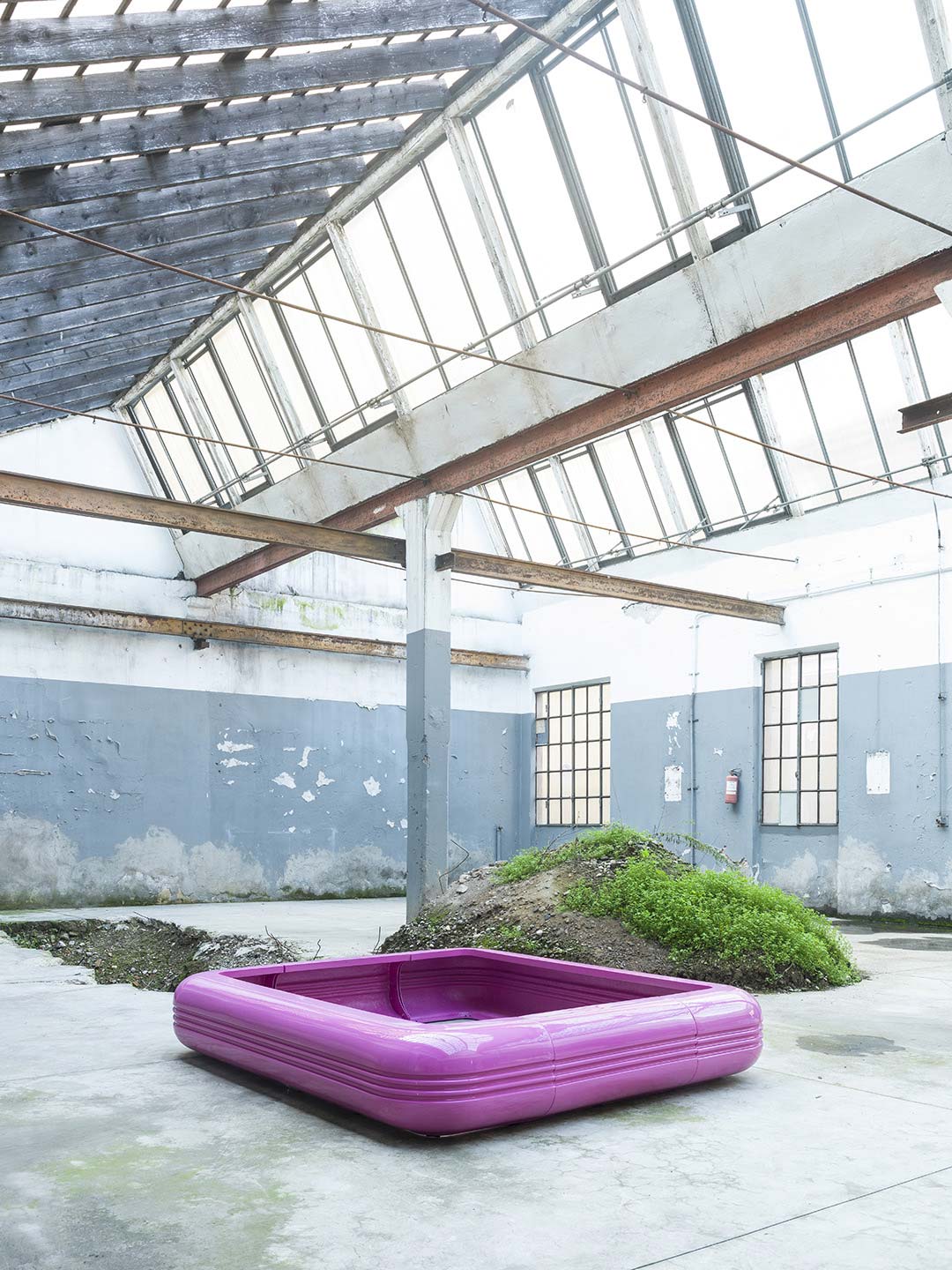
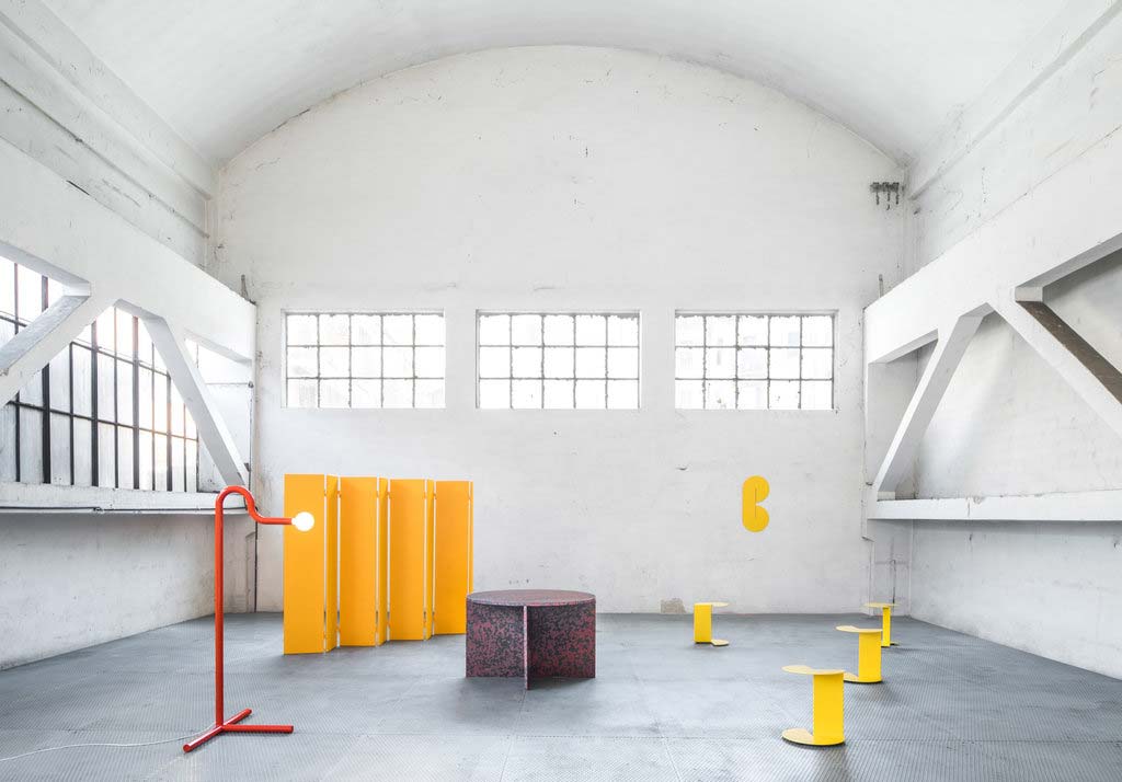
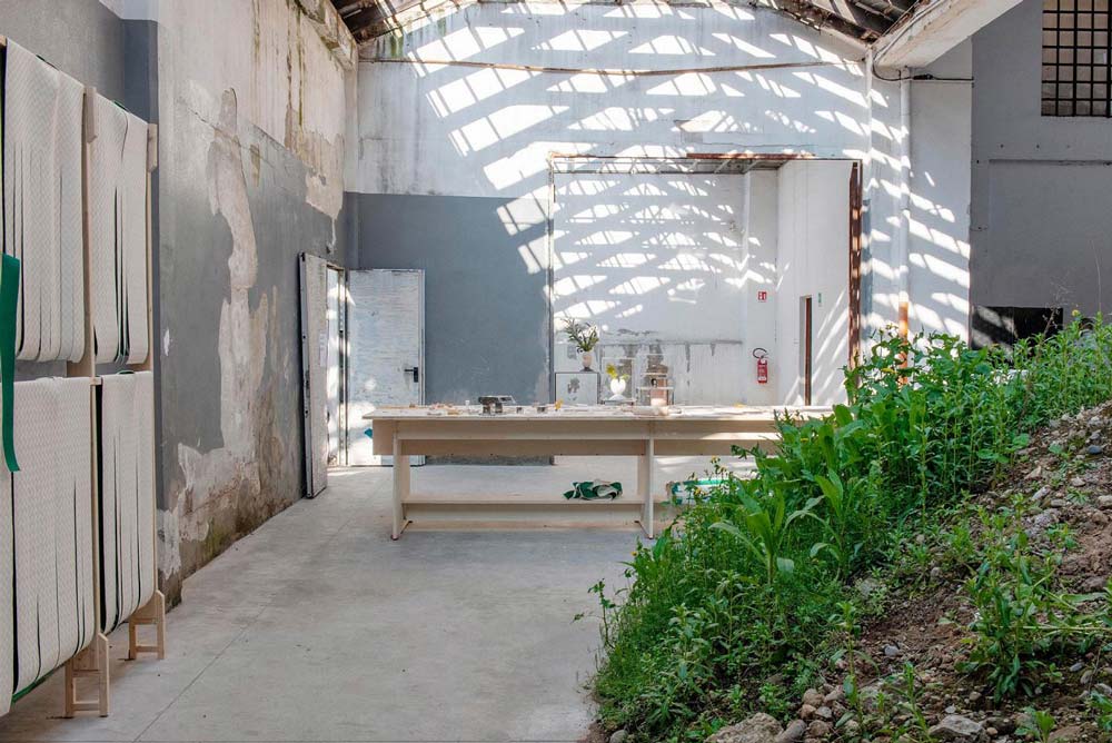
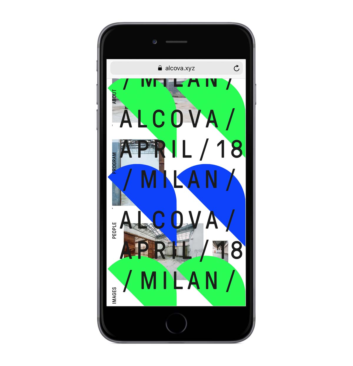
During Fuorisalone 2018, ALCOVA opened the doors of one of Milan’s most historic panettone factories to the public. The complex’s vast spaces - partly taken over by plants and vegetation - hosted projects by designers, institutions, galleries, and companies working at the avantgarde of themes such as contemporary living, design culture, materials, and technological innovation. Along with Space Caviar and Studio Vedèt I curated and produced the exhibition for which we created a visual identity in which bold fluorescent coloured forms, shaped as alcoves hover over images in a multi-layered website. This represents the powerful synergies and overlapping entities of the old factory and the contemporary projects which it contains.
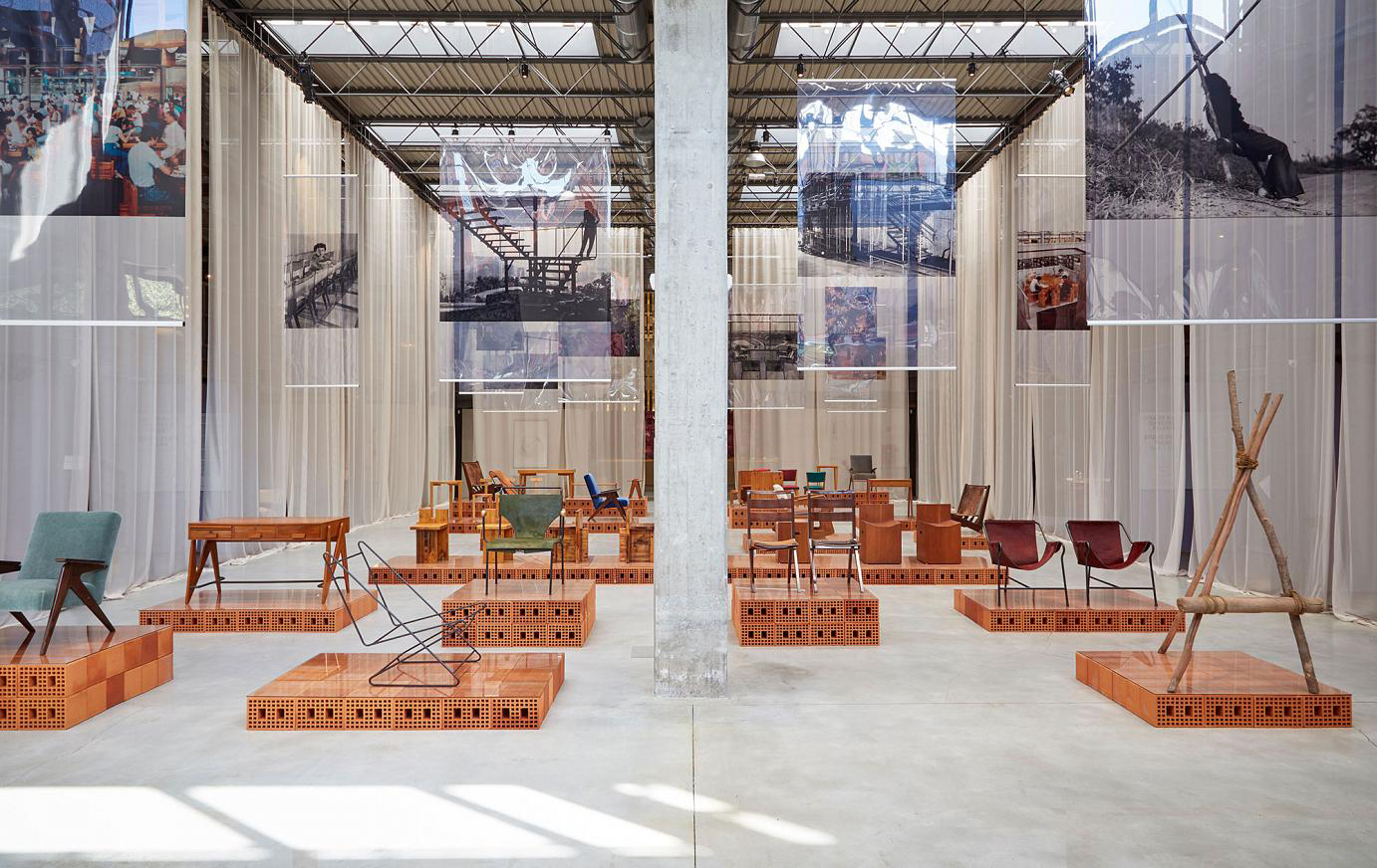
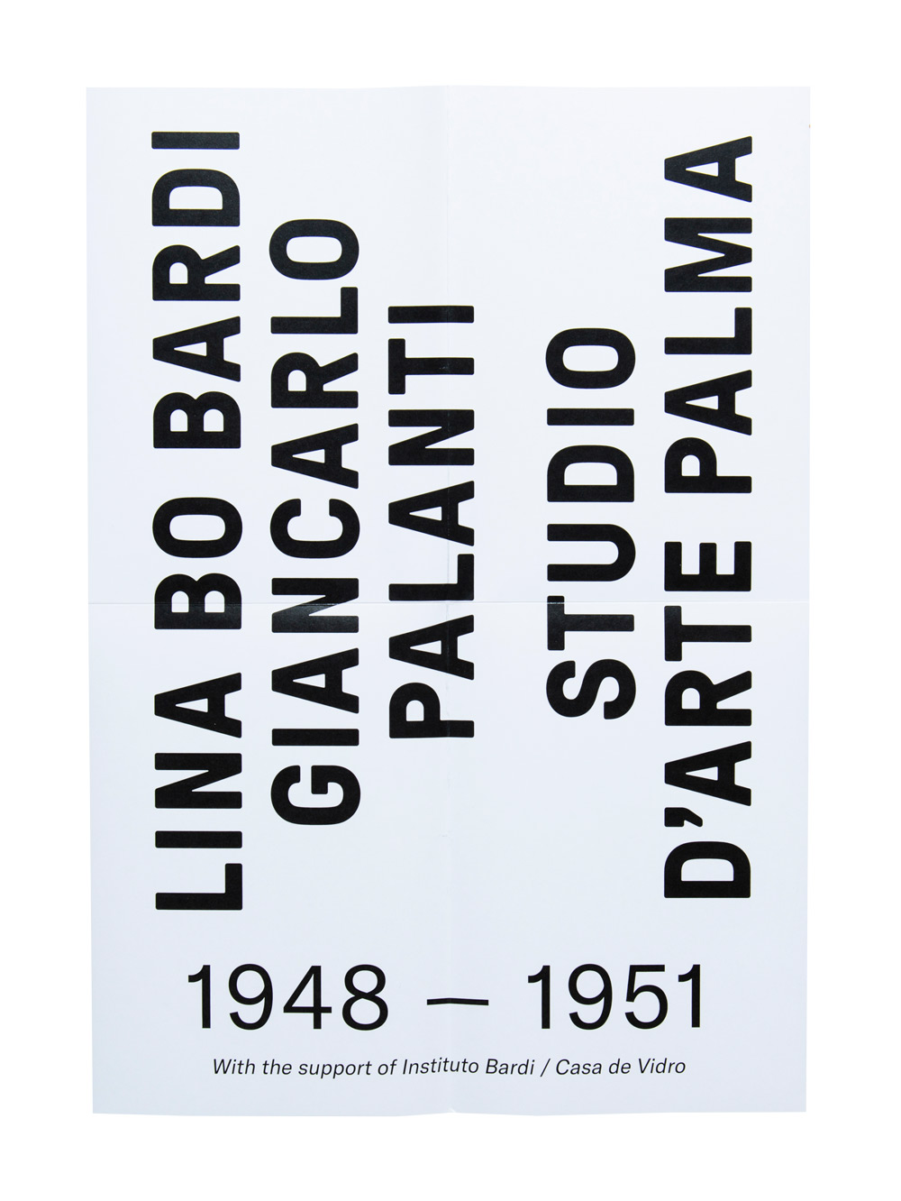
Within the context of Fuorisalone 2018, with Studio Vedèt, I acted as a creative consultant for the major “Lina Bo Bardi Giancarlo Palanti – Studio D’arte Palma” exhibition organised by Nilufar gallery. Focusing especially on work realised within Studio Palma, this exhibition presents the largest collection ever brought together of Lina’s furniture. Vedèt created the show’s visual identity, catalogue and website presenting texts, images, videos and historical documents about the late designer.
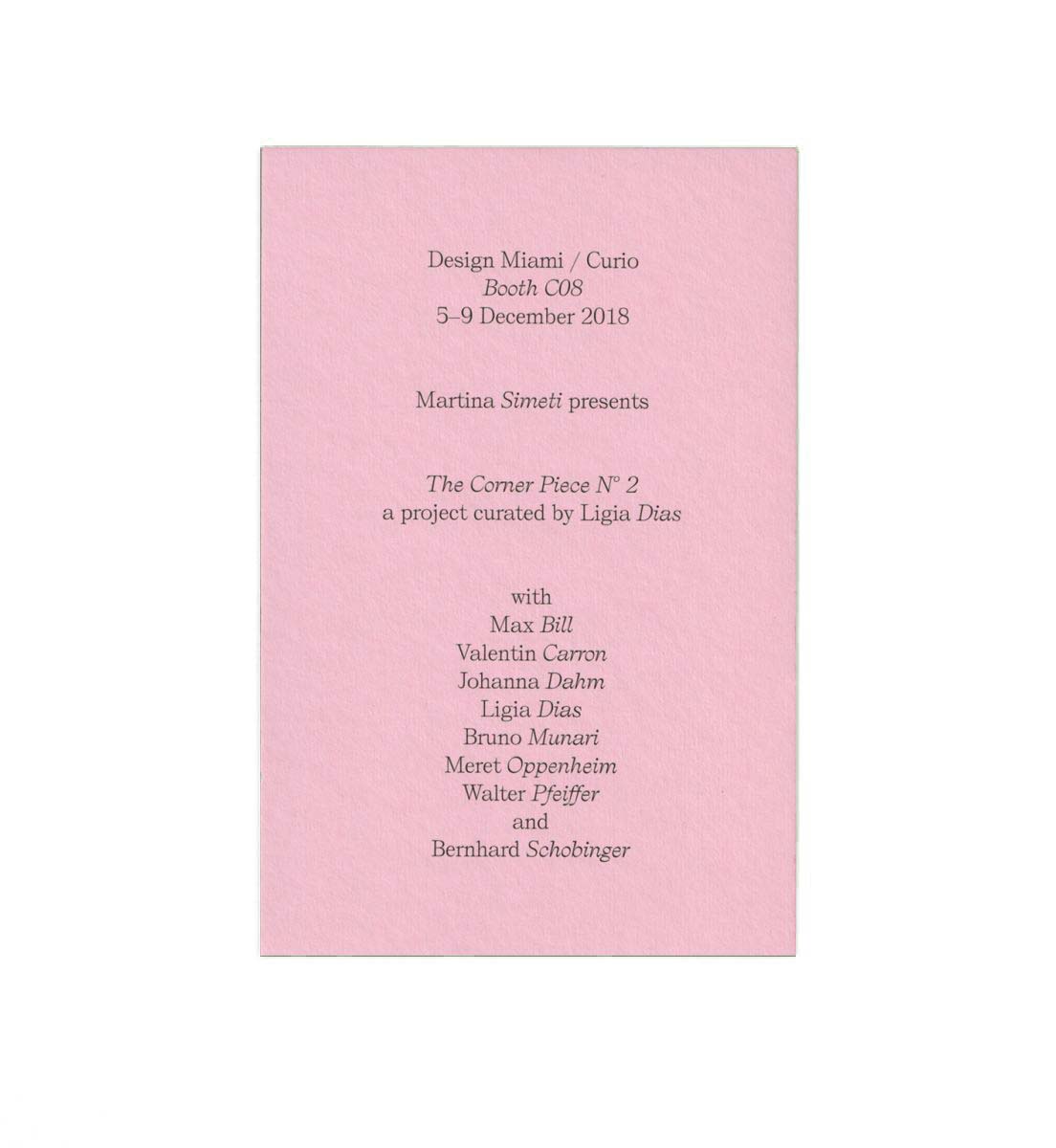
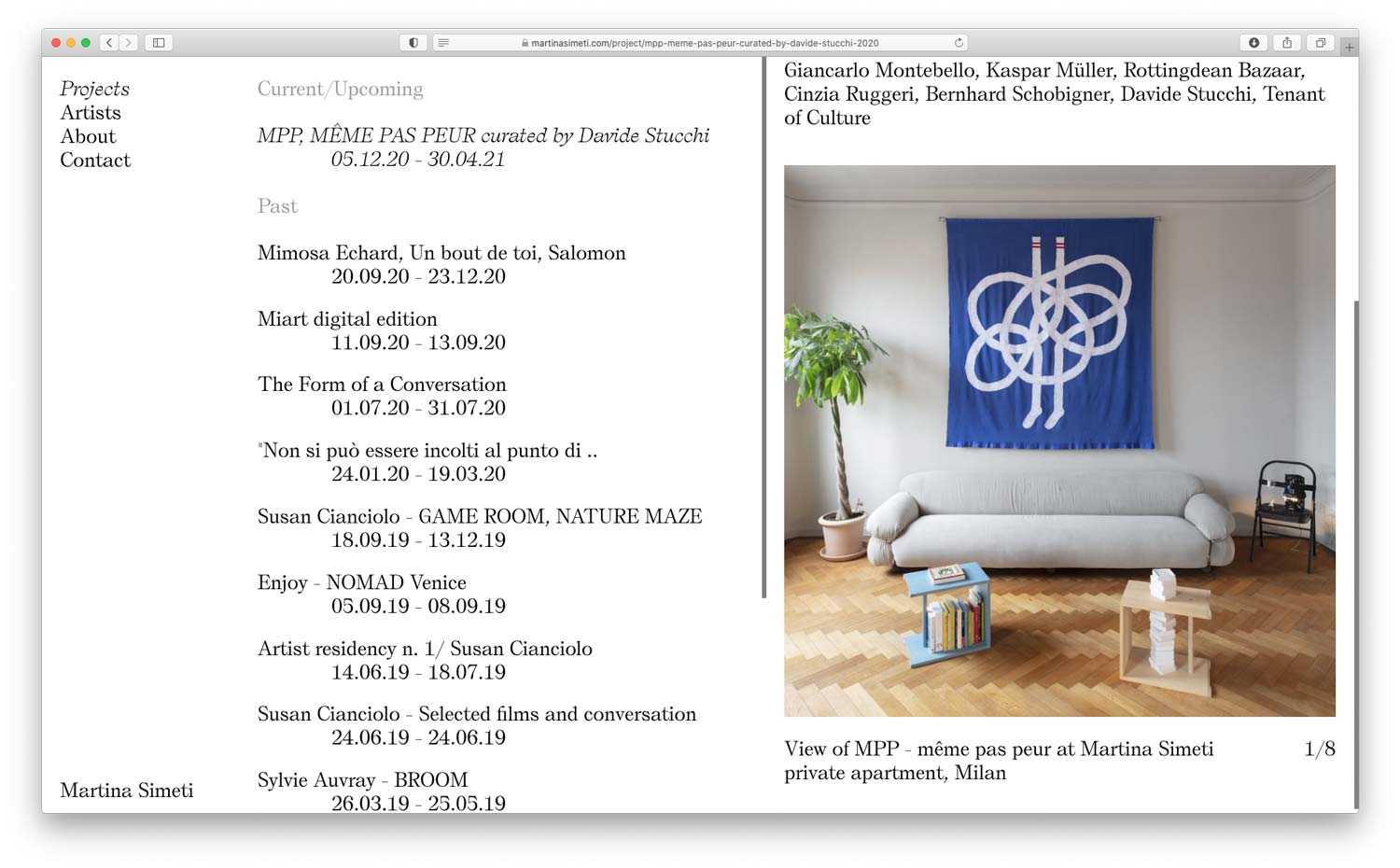
Martina Simeti’s curatorial project consists of an exhibition space and a laboratory. It welcomes international artists — whose interdisciplinary work toggles the border between conceptual and applied design. With Studio Vedèt I created the visual identity, a minimalist website and vernissage invites.